Green is green, right?
Maybe if you’re celebrating St. Patrick’s Day, but not when your bottom line is impacted by color accuracy.
In the color industry, a tolerance is the acceptable amount of difference between a standard (the color you’re trying to match) and a sample (the color you are producing). To determine whether a color is within tolerance, many manufacturers use a color measurement device called a spectrophotometer to measure both colors and compare the difference between them. This difference is known as the Delta E.
Generally, the amount of color difference that the naked eye will notice is somewhere around a Delta E of 1 (a trained colorist may be able to see much less), but that’s just a starting point. Acceptable color tolerance varies by application and industry.
If you’re printing billboards on a wide-format printer, for example, the color doesn’t need to be as exact as it does for small plastic toy parts that must match once they’re assembled. While a Delta E of 3, or even 5, may be acceptable for the billboard, the toy won’t pass inspection if the color of the parts is farther apart than a Delta E of 1.
There’s something else that must be considered when setting tolerances in manufacturing, and it’s great news for manufacturers producing St. Patrick’s Day merchandise. It’s harder for us to detect slight shifts in the color green than it is in other colors like reds, blues, and tans.
Today we’ll look at an experiment conducted by David MacAdam in the 1940s that helps us understand why some colors have tolerances that are farther apart than others.
The Experiment
David MacAdam, a research scientist at the Eastman Kodak Company, wanted to find out how closely the company had to produce “Kodak Yellow” before the human eye would notice it wasn’t right.
MacAdam created a large set of “Kodak Yellow” samples in perfect and near perfect shades. He then asked his co-workers sort them into shades that matched, and shades that didn’t. Using a GE-Hardy recording spectrophotometer, one of the first color measurement devices of the time, he measured and plotted each yellow on the CIE Chromaticity Diagram. The results formed an elliptical zone of yellows that were acceptable matches to the original.
MacAdam followed the same methodology to expand his experiment to other colors. Similar to the Kodak yellow, he continued making slight changes to each color’s hue, chroma, and lightness until his test subject noticed a visual difference in the color. He then plotted the results as perceptibility limits around the original color.
MacAdam’s Surprising Discoveries
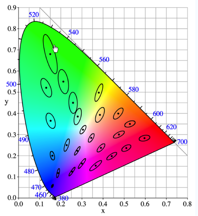
The human eye’s ability to detect color differences is ellipsoidal in shape when the data is plotted on the CIE Chromaticity Diagram.

This CIE Chromaticity Diagram shows the resulting ellipsoids for colors that David McAdam measured and plotted as perceptibility limits around each color target.
These ellipsoids are all different sizes depending on the position of the color in color space. Some ellipsoids are larger, like those in the green area, allowing more change in color before it is noticeable. Others, like those in the blue and purple area, are much smaller, meaning colors differences can be perceived with much smaller changes.
He also learned that the human eye does not weight hue, lightness, and chroma equally in its matching process. Rather, we’re roughly twice as sensitive to shifts in hue as we are to shifts in either chroma or lightness.
The Impact of Perceptibility Tolerances
Being aware of these limits in perception will help you set realistic tolerances. For instance, if you’re trying to achieve an accurate blue, you’ll need to set a fairly tight tolerance for most applications. However, if you’re trying to achieve green, you can probably allow a little more room for error.
Of course, there’s more to this topic, and you can learn all about it in our one-hour e-learning course, Color Measurement Essentials.
As for St. Patrick’s Day…
Since you now know humans have the largest tolerance to green, chances are nobody will notice whether your green socks match your green pants, anyway.

