You say color is important, but do you know why it’s so important? In reality, color is a critical element in the manufacturing process. Unfortunately, many manufacturers are realizing that getting color right is much harder than it used to be, and the brands they support are asking them to meet tighter tolerances.
Here’s why.
While advances in color technology – think metallic packaging, pearlescent finishes, custom fabrics and vibrant new colors – entice customers, they also make it much more difficult to achieve consistency.
Take composite decking for example. You used to have two choices: gray or brown. And as long as you had harmony across the entire deck, customers were happy. But now with so many options – deep wood-grain patterns and exotic colors – manufacturers have to manage dozens of colors instead of two or three. Achieving consistency is much more difficult,
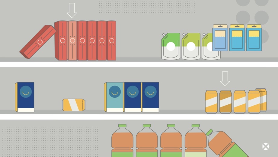
Packaging is another great example. Store shelves that used to be lined with printed boxes now include foil pouches, blister packs, and multi-substrate displays. Color is especially difficult to control with reflective and translucent surfaces, and what works for one doesn’t necessarily work for another.
Package designs come together on the shelf. Here you see pouches, labels, cartons, and corrugated with visual inconsistencies—these are issues that can be overcome.
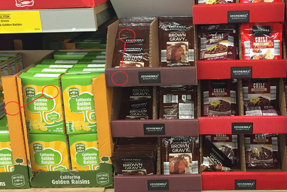
Color that used to pass is no longer good enough.
From textiles to plastics to paint and coatings, the story is the same across every industry. And consumers and brand managers are getting pickier. If color doesn't look right, consumers will pass by the offending package or product for a competing brand, and the rejected products often end up as wasted inventory.
This is causing brands, printers, and manufacturers a great deal of stress. Are you in that boat?
- Do you step outside in daylight to evaluate color?
- Are you emailing photos for others to evaluate and approve?
- Are you uncertain exactly which color you’re expected to produce?
- Is color that used to be “good enough” now being rejected?
If you answered YES to any of these questions, your visual evaluation program has room for improvement. Luckily it doesn’t require a lot of time, money, or effort to take the first step on the journey to consistent color.
Let’s take a look at the most common places color goes wrong in visual evaluation programs.
1 – The wrong lighting
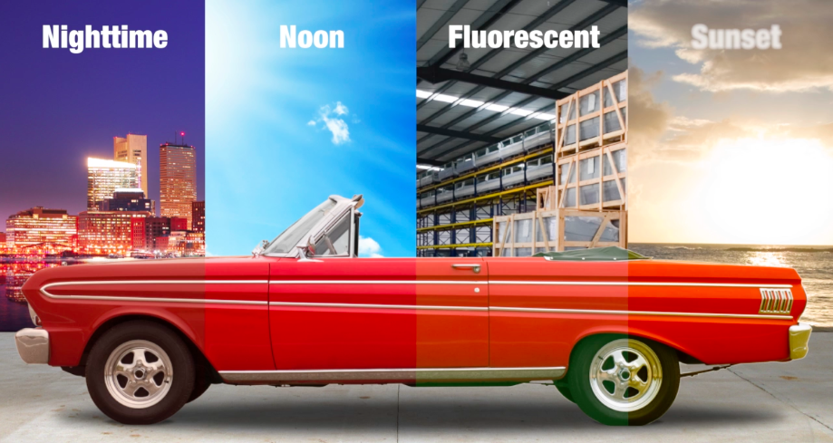
This image demonstrates why it’s important to evaluate color under standard lighting. See how the shade of red changes with the type of light?
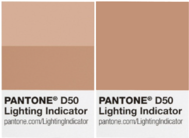 But what if you don’t know if the lighting in your lab or office is standard? Don’t cross your fingers and hope. PANTONE® LIGHTING INDICATOR Stickers are a much better option. Each sticker has two patches. If they match, you’re working under natural daylight conditions. If not, you should move to a different light source before making color decisions.
Of course, LIGHTING INDICATOR Stickers won’t show you how your colors will look under the fluorescent, incandescent or LED lighting found in stores, offices, and homes. The best way to know how your finished products will look once they enter the world is to use a light booth.
This is especially important if you’re producing parts that will be assembled into a final product, such as a cell phone case with a plastic back and rubber sides, or the side mirrors for a vehicle that must match the body at assembly. Just because they match your “golden sample” or physical reference under daylight doesn’t mean they’ll still look good in store, showroom or home lighting.
Light booths don’t have to be a huge investment, and the payoff in fewer rejections will come fast. To learn more about how they work, check out 10 Tips For Visually Evaluating Color.
2 – Less than perfect color vision
Most people don’t even know they have some type of color deficiency, but it is incredibly common. In fact, about one in every 13 men and one in every 300 women exhibit some type of color deficiency.
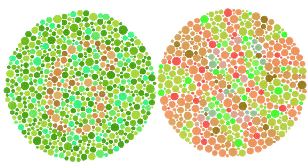
This is the Ishihira Color Vision Test. If you don't see a "6" in the left circle and a "2" in the right, you probably suffer from some type of color deficiency.
If you’re responsible for making color decisions, you really should take the physical test… which you can do as part of our Fundamentals of Color and Appearance seminar. If you’re just curious, the online color challenge is a fun, fast way to understand your color vision acuity.
3 – The wrong physical standards
If you use physical standards, that’s great! They’re a precise way to communicate and evaluate color… as long as you follow a few basic guidelines.
First, they need to be made from the right material. Let’s say you’re producing terrycloth fabric that will be used to make towels. Using a paper standard to evaluate the fabric color will not give you accurate results. Since material behaves differently with pigments, inks, or dyes, you need a standard that’s made from the same material to make good color decisions – a huge point of frustration for many manufacturers.
But, just like everything, physical standards are subject to dirt, smudges, and fading. Our Ultimate Guide to Caring for Physical Samples can help you keep yours in tip top condition.
4 – Inconsistent device color
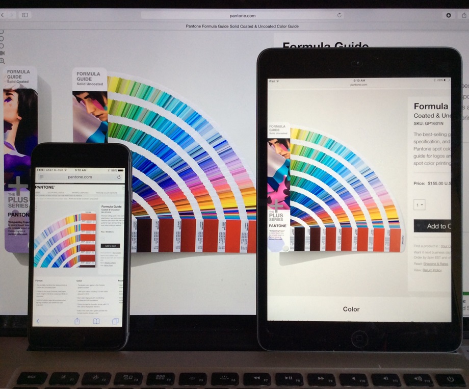
If you’ve ever walked into an electronics showroom and noticed the wall of new TVs showing completely different color, you already know inconsistent device color is a problem. Yet many of us don’t think about that when we’re using our handheld devices or computers to make color decisions. Did your camera capture the right color? Is the person you’re sending it to for approval seeing the right color?
Although sending photos electronically is not the best way to make color decisions, if sharing physical samples isn’t feasible it will help to color calibrate all of the devices involved.
Do You Rely on Visual Evaluation?
Great color is an ongoing journey. Although new substrates and manufacturing processes may be adding chaos to your color control program now, color tools are also getting smarter. Take advantage of all there is to offer and get your color back on track!
If you already use light booths and color measurement tools, you’re at a different stage of the color journey. We’ll be taking this discussion to the next level in an upcoming blog post, so stay tuned!
Featured X-Rite Color Management Solutions
Learn more about these featured products:
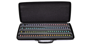 |
Farnsworth-Munsell 100 Hue TestThe FM100 Hue Test is an easy-to-administer test and a highly effective method for evaluating an individual's ability to discern color. |
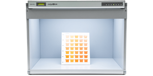 |
Judge QCWith 5 light sources including class B daylight and optional LED, this compact, entry level light booth is an economical way to visually evaluate the color of smaller samples under controlled lighting. |
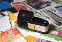 |
eXact 2 FamilyWith innovative features like first-to-market, patented MantisTM video targeting and Digital Loupe zoom technology, eXact 2 is the ideal choice for brands, printers, converters, and ink suppliers. |
