

Brands may not have a line item in their budget for color, but it can impact the bottom line in different ways. Understanding the true cost of color can help accelerate go-to-market, reduce waste, and save thousands. Color plays a big role in purchase decisions when you consider it only takes shoppers 2 to 7 seconds to select an item from the shelf. To stand out, brands must introduce interesting designs to launch new varieties and seasonal specials, while considering the impact new packaging wi...
Posted November 12, 2024 by Cindy Cooperman

Originally published May 3, 2024 from https://canmaker.com/light-touch/ Industry stakeholders came together to explore ink and proofing standards for two-piece beverage cans. Nisa Ali reports from Manchester Leading companies across canmaking industry supply chains are considering general guidance for PantoneLIVE colours in the production of two-piece beverage cans. Following a series of seminars discussing the role of PantoneLIVE colour libraries in the design, proofing and printing process ...
Posted October 29, 2024 by
.jpg?h=350&la=en&w=700&hash=6B13107860AEFC9900E0C32B5DDDEEC61B4B5475)
Brands invest a great deal of time and resources when selecting a new color to represent their products. If the color doesn't match expectations after printing, runs are wasted, and everyone is left wondering where the color went wrong. Here's a typical scenario. A brand selects a season color for product packaging and communicates that color to the designer. The designer integrates the color into the design and hands it off to the premedia team to convert it into print-ready files. The files a...
Posted September 13, 2024 by X-Rite Color

Originally published May 3, 2024 from https://canmaker.com/light-touch/ Industry stakeholders came together to explore ink and proofing standards for two-piece beverage cans. Nisa Ali reports from Manchester Leading companies across canmaking industry supply chains are considering general guidance for PantoneLIVE colours in the production of two-piece beverage cans. Following a series of seminars discussing the role of PantoneLIVE colour libraries in the design, proofing and printing process ...
Posted August 26, 2024 by X-Rite Color
A recent amendment to the EU Directive on the restriction of the use of certain hazardous substances in electrical and electronic equipment will remove the current exemption for mercury to be used in a number of types of fluorescent lamps for special purposes by 24th of February 2025. These bulbs are defined under clause 2(b)(4)-I of the EU REACH directive. After the expiration date, the sale of new equipment including fluorescent technology under this exemption will not be allowed in Europe. Th...
Posted February 12, 2024 by X-Rite Color

The internet is full of Top 10 Countdowns. We enjoy looking back at our most popular blogs and learning resources to better understand what interests you – our readers. We’ve been publishing our top-read learning resources since 2016, and we’re happy to see some educational topics like color perception, tolerancing, and spectrophotometers continue to rank year after year. Here’s a list of the topics our readers enjoyed most in 2023. Have you read them all? Top 5 X-Ri...
Posted February 02, 2024 by X-Rite Color

The environmental footprint of fashion is out of control. According to the National Resources Defense Council (NRDC), “Textile mills generate one-fifth of the world's industrial water pollution and use 20,000 chemicals, many of them carcinogenic, to make clothes.” Fabric being dyed in factory. Image from NRDC.org. A Problem That Impacts Everyone Did you know it takes about 200 tons of water (enough to fill several swimming pools) to produce one ton of cott...
Posted April 12, 2023 by X-Rite Color

If ensuring color consistency is part of your job description, you’ll want to learn more about PantoneLIVE. Our customers report that it helps them get products to market an average of four times faster! PantoneLIVE is an end-to-end, digital color communication ecosystem that helps everyone involved in a packaging workflow visualize and communicate color. It shows which colors are achievable, and which are not, across everything from flexible packaging to corrugated board. And, since the digital...
Posted March 15, 2023 by X-Rite Color
.jpeg?h=285&la=en&w=400&hash=AC6EC8E66937FAB0B91715E08CE3FBCBE0296113)
When all of final production packaging comes together on the store shelf, it’s a brand’s moment of truth. Do the stand-up pouches, overwraps, and corrugated POP displays match? How close is the color to its standard? We know you spend so much time and money designing, proofing, sampling, printing, and shipping… so where does the color go wrong? Is it an issue with accuracy, consistency, or both? Package designs come together on the shelf. Here you see pouches, labels, cartons, and corrugated wit...
Posted March 15, 2023 by Cindy Cooperman

What happens when you have more than 2,000 brand colors to manage across a complex global packaging supply chain? Things get complicated! Although it may seem easier to create a new color than to dig through databases or binders of color drawdowns to find the closest match, the problem comes later when you’re faced with a huge, unmanageable library. One of our clients, a well-known fast-moving consumer packaged goods (FMCG) company, understands how easily things can get out of control. They wer...
Posted March 15, 2023 by Cindy Cooperman

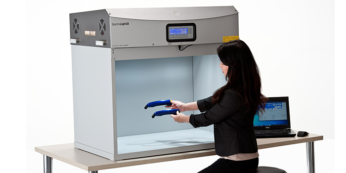
Does your quality control program include visual evaluation? If not, it should. Using the SpectraLight QC as part of a color evaluation workflow. No matter your industry, judging color is more than just measuring samples with a color measurement device. Just because a spectrophotometer says your color is within tolerance, doesn’t necessarily mean it will look right to the human eye. To minimize customer rejects, your color control process needs to include visual evaluation in a light boo...
Posted March 15, 2023 by X-Rite Color

Like you, digitization and sustainability are top of mind. However, colour is often overlooked when it comes to textile product development. Digitizing the textile supply chain and applying colour management at each stage will ultimately pay for itself through more accurate colour, faster production, and less waste. With over 60 years of innovation and proven expertise in colour management and colour measurement, X-Rite has solutions to support everyone in the textile industry, including appare...
Posted March 13, 2023 by X-Rite Color
.jpg?h=285&la=en&w=400&hash=CF098B5757EE43CE3966F416E1D31AE6A67A8104)
Whether you’re choosing colors for a brand, creating palettes for a new product line, or designing seasonal packaging, inspiration is a key step in color selection. Inspiration can come from normal, everyday places, for example: A party. The grocery store. Sporting events. And of course, the great outdoors. Mother Nature has a knack for creating the most beautiful color palettes. “Colors for Autumn/Winter 2022/2023 contrast our competing desires for calm and comfort with energy boost...
Posted November 04, 2022 by X-Rite Color
.jpeg?h=285&la=en&w=400&hash=6F4520F30E11DA92838E11C8E55C4BFB32664563)
You say color is important, but do you know why it’s so important? In reality, color is a critical element in the manufacturing process. Unfortunately, many manufacturers are realizing that getting color right is much harder than it used to be, and the brands they support are asking them to meet tighter tolerances. Here’s why. While advances in color technology – think metallic packaging, pearlescent finishes, custom fabrics and vibrant new colors – entice customers, the...
Posted November 01, 2022 by Cindy Cooperman

There are many things that affect our ability to see color. In some cases, it doesn’t matter if the red you see is the same shade I see. A barn is a barn, right? But for those who work in an industry where color evaluation is part of the job, it IS important… VERY important. In our color perception series, we’re discussing the many factors that affect how we see color and what colorists can do to ensure that the color they see is the color they are supposed to see. Today we’ll take a closer look...
Posted August 31, 2022 by X-Rite Color

As the temperature of light changes, so does our perception of color. As I mentioned in our last post, light plays a huge role in the way we perceive color. Today we’ll look at the science of color in manufacturing and photography; specifically how an object’s reflective and absorptive properties and viewing technology can impact the colors we perceive. To reflect or not to reflect… that is the question. The colors an object absorbs and reflects is determined by its material – is it metal, plas...
Posted August 31, 2022 by X-Rite Color

According to autolist.com, over 80% of cars produced today are white, black, or some shade of gray. It’s not necessarily because bright and bold colors are more difficult to produce and match than their grayscale counterparts, they just take longer to get through the inspiration and car design process. Believe it or not, producing a new auto color can take up to five years before it makes it to the showroom floor. It’s a long, tedious process for designers, paint...
Posted June 27, 2022 by X-Rite Color

L&E International, Ltd is a global provider of sustainable, innovative packaging solutions. As a certified packaging supplier for adidas, Verizon, Amazon (APASS vendor in Asia), Target, and many other brands and retailers, L&E maintains and upholds strict brand color standards across multiple countries and locations of manufacture. Last year, L&E selected X-Rite digital color workflow solutions to maintain their high color matching expectations. We are excited to be working wit...
Posted June 06, 2022 by X-Rite Color

As the range of substrates, inks, and printing technologies has expanded, so has the challenge of maintaining color quality for brands and printers. A workflow based on digital standards is the easiest way to achieve accuracy and consistency across shifts and sites, regardless of production requirements. Adding a quality control solution like ColorCert® to your workflow can boost your bottom line even more. What is ColorCert? ColorCert is a modular, job-based solution that streamlines color ...
Posted April 26, 2022 by X-Rite Color

Each year we enjoy looking back to see what our customers enjoyed reading. Here are our top blogs and learning resources from 2021. Top Blogs of 2021 Some of these blogs make the top 10 list every year. Do any interest you? Color Perception Part 1: The Effect of Light This first blog in a 3-part series offers a non-technical explanation to the way we perceive color, and the role of light in color perception. How to Calibrate your Monitor in 10 Steps Are ...
Posted December 21, 2021 by X-Rite Color

Light booths provide a controlled environment for judging color under different lighting conditions. They can help visually evaluate how different types of light will affect the perception of color, evaluate the color of raw materials before and after production, and ensure different components will remain uniform once they’re assembled. But not all light booths are the same. With NIST traceability and ISO 17025 accreditation, X-Rite offers worldwide competence in calibration, cert...
Posted December 13, 2021 by X-Rite Color

The best way to visualize how color will react in real world lighting conditions is to use a quality light booth. Traditional light booths contain common illuminants like daylight, incandescent, and fluorescent to replicate how color will look in the retail store and post-purchase in outdoor and home lighting. Today, the increased use of LED lamps in home, commercial, and retail environments is impacting decades of standardized lighting procedures. How LED is Changing the Game LED li...
Posted November 03, 2021 by X-Rite Color

Extended Gamut Printing Increased product variation and lean manufacturing demands are forcing converters to work quicker and more cost-efficiently. Implementing extended gamut printing, also called fixed color palette printing, is a great way for brand owners and designers to specify achievable color, and for converters to reduce press setup time, produce smaller lot sizes, and increase press efficiency. In this video, X-Rite Pantone Color Expert Mark Gundlach explains extended color g...
Posted October 16, 2021 by Mark Gundlach

Color measurement is used to specify, quantify, communicate, formulate, and verify color quality for color critical work. Because everyone perceives color differently, color measurement is more precise than visual evaluation. How to Measure Color Wavelength To measure color, a color measurement device called a spectrophotometer shines light onto a sample and captures the amount of light that is transmitted or reflected in the 380 nm to 780 nm wavelength range, which is the wavelength rang...
Posted August 24, 2021 by X-Rite Color

Learn about light, reflection curves, optical brighteners, and more. Illuminants Electro magnetic radiation in the wavelength range from 380 nm to 730 nm is seen as light by our eyes. Low wavelengths show as blue light, then the spectrum continues from green to yellow, orange, and red. UV radiation is located in the range below 380 nm; the range above 730 nm is called infrared radiation. The visual impression of a colored body changes by the composition of the incoming light. ...
Posted July 22, 2021 by X-Rite Color
Each year we enjoy looking back to see which blogs captured the most attention. Some make the top 10 list ever year, while others are a surprise. Here's what our readers found most interesting in 2020. Top 10 Blogs of 2020 #1 L*a*b* Color Values Like geographic coordinates – longitude, latitude, and altitude – L*a*b* color values give us a way to locate and communicate colors. Learn the history and uses of this popular color space. #2 &nbs...
Posted December 29, 2020 by X-Rite Color

COVID-19 has forced many companies to rethink the way they communicate, approve, and produce color. For some, that means trying to conduct “business as usual” from a remote location. For others, it means finding ways to manage color without travel. Either way, we know our customers are doing everything they can to sustain business while keeping their employees healthy and safe. We want to help. Over the past few months we’ve been adding new resources to our virtual resou...
Posted December 15, 2020 by X-Rite Color

The Pantone Color of the Year announcement is always exciting. Not only does it set the stage for upcoming trends, it also provides brand owners and designers critical guidance for marketing and product development. However, those who are charged with manufacturing products and packaging with trending colors (like 2021's Ultimate Gray and Illuminating) know it doesn’t “just happen.” It takes time and effort to incorporate new colors. Whether you work in paints, plasti...
Posted December 14, 2020 by X-Rite Color

The Pantone Color Institute just announced PANTONE 17-5104 Ultimate Gray + PANTONE 13-0647 Illuminating as the Pantone Color of the Year 2021. According to the Pantone Color Institute, PANTONE 17-5104 Ultimate Gray + PANTONE 13-0647 Illuminating, a marriage of color conveying a message of strength and hopefulness that is both enduring and uplifting. Illuminating is a bright and cheerful yellow sparkling with vivacity, a warming yellow shade imbued with solar power. Ultimate Gray is emblematic of...
Posted December 14, 2020 by X-Rite Color

Recently we had the opportunity to sit down with Laura Guido-Clark, a consumer products designer of color, material, and texture. She has been dubbed an “Experience Consultant,” which reflects her interest and study of human reactions to the look and feel of new products. Photo by Laura Flippen. We asked Guido-Clark to speak with us because we also appreciate the importance of color in our lives. Q. What inspired you to pursue a career in color? A. When I wa...
Posted September 01, 2020 by X-Rite Color

As the industrial plastics market grows increasingly competitive and demands more sustainable practices, manufacturers need new ways to formulate and produce accurate color faster, with less waste. Digital color standards are one of the most effective tools to bridge this gap. They also enable color work and communication from remote locations. With digital color standards, brands and designers can set clear expectations with supply chains. In turn, suppliers can achieve color goals wit...
Posted July 31, 2020 by Tim Mouw

In a highly competitive marketplace, brands and packaging designers are looking for ways to differentiate their products on the shelf. This increasingly goes beyond color to include embellishment options such as foils, special varnishes, soft touch finishes, and more. Designers are also using more intense solid colors, fluorescents and iridescents, and not just with conventional print. Digital solutions allow more variation in packaging and the ability to address shorter runs and faster cycle ti...
Posted June 04, 2020 by Ray Cheydleur
No matter the industry, our customers are all working toward the same goal: Achieve accurate color and keep production moving. Even in the best conditions, color data can be a challenge to capture and share. COVID-19-related travel bans and social distancing guidelines are making it harder than ever. Today we’ll share three easy ways to remotely share color data so you can achieve your color goals without shipping physical samples or making onsite visits. The Benefits of Digit...
Posted April 30, 2020 by Tim Mouw

G7® is a proof-to-print process control method that allows you to reliably and efficiently match the visual appearance of the output from multiple printing devices. It works by defining the gray balance and NPDC curves in conjunction with the traditional method of measuring tonal value increase (TVI/dot gain) for each color. G7 can be applied to any type of printing, regardless of the type of ink or printing method, including all types of digital, offset, flexo, gravure printing. It&r...
Posted February 27, 2020 by Mark Gundlach

Appearance is more than just color. It’s an all-inclusive look at everything inherent to an object, including texture, gloss, transparency, translucency, and special effects like sparkle and shimmer. When viewed from different angles or under different lighting conditions, appearance effects can change our perception of color. That's why it’s important to control both color and appearance throughout design and development. Durable goods brands use appearance effects to captur...
Posted February 20, 2020 by X-Rite Color

Although digital printing has been around for many years, the industry is undergoing dramatic changes. On the plus side, digital print technologies utilize more durable inks and offer higher reliability, longer print life, and overall cost savings and efficiency. But these changes also mean print shops must adjust the way they operate to remain competitive. According to Allied Market Research, the digital fabric printing market is expected to reach almost $4 million globally by 2022,...
Posted January 23, 2020 by Ray Cheydleur

When it comes to human color perception, our eyes can be deceived. This is partially caused by our humble brain, which is managing vast amount of information and processing it the best it can. It can also be related to genetics and the environment; we all see color a little differently. But above all, LIGHT has biggest impact on the colors we see in everyday life. Without getting too technical, here is an introduction to the way light affects our perception of color. RGB Color Circle Th...
Posted January 06, 2020 by X-Rite Color

Over the last few years, we have heard a lot about the circular economy and omnichannel marketing. While each is a trend in their own right, they are quickly converging on the print industry. To be successful in 2020, commercial printers will need to offer a wide range of print capabilities while demonstrating a commitment to sustainability and reducing waste. The Importance of Circular Economy and Omnichannel In a circular economy, the goal is to eliminate waste and maximize the con...
Posted December 19, 2019 by Ray Cheydleur

Virtual reality has re-imagined the art of apparel and footwear design. 3D design programs like MODO, KeyShot, CLO, Browzwear, Optitex, and Lectra augment the creativity of color and material designers to virtually construct patterns and render realistic 3D garments. This is exciting technology for brands that want to reduce waste for a greener footprint and accelerate design to keep up with fast fashion. However, designers are notoriously tactile. They need to touch, feel, and gain a...
Posted October 24, 2019 by Bruce Wright

With so many requests for innovative bases, transparency, and special effects, formulating color for paint, coating, and plastic applications can be a challenge. To keep up, formulation software needs to be innovative, too. We recently launched version 10 of our Color iMatch formulation software, and it is our smartest version yet. It allows you to select cost-reducing parameters, such as lowest cost or fewest colorants, and will determine the best formula for your application. It work...
Posted July 10, 2019 by Rich Knapp
