To control color, you need to be able to compare very small differences, determine their impact and understand how to address that impact. In this series we’ve already looked at the history of color analysis and the role of light in tolerancing. Today we’ll discuss the difference between a color space and a color tolerance and introduce the most common methods.
Color Spaces
A color space gives us a way to communicate color. Just like we can find any location on planet earth using longitude, latitude, and altitude, we can locate any color in color space.
Here are the two most common color spaces.
L*a*b* aka CIELab, aka LAB Model
 In the 1940’s, Richard Hunter introduced a tri-stimulus model, Lab, which is scaled to achieve near uniform spacing of perceived color differences.
The L axis represents differences in dark colors versus lighter pastels, with absolute white at 100 and absolute black at 0. The rectangular coordinates a and b represent the major color axes, with red at positive a and green at negative a; yellow at positive b and blue at negative b. The intermediate hues are between the major color hues of red, yellow, green and blue.
While Hunter’s Lab was adopted as the de facto model for plotting absolute color coordinates and differences between colors, it was never formally accepted as an international standard. Thirty-one years later, the CIE published an updated version of Hunter’s Lab: CIELab. The correct way to pronounce it is “see-lab”, or “L-star, a-star, b-star,” but some applications and instruments simply call it L, A, B, or Lab.
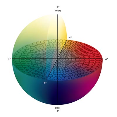
CIELab navigates through a grid-like color space containing all of the colors we can see. With only a few small changes to Hunter’s original math, this new map became the recommended and internationally sanctioned method for reporting colorimetric value.
L*C*h° (aka CIELCH) Model
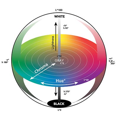
In this model, L for stands for lightness, C for chroma, and H for hue. Hue moves in a circle around the “equator” to describe the color family – red, yellow, green, and blue – and all of the colors that fall in-between. The numbers in the hue circle range from zero to 360, starting with red at zero degrees, then moving counter-clockwise through yellow, green, blue, then back to red.
The L axis describes the luminous intensity of the color. By comparing value, you can classify colors as light or dark. Just like the L*a*b* model, a lighter color has a higher value. The C axis represents chroma, or saturation. Lower numbers near the center are more dull and gray, while higher numbers near the perimeter are more pure, vivid and saturated.
Color Tolerancing
If you can plot two colors in color space, you can calculate the distance between them. The tolerance is an assessment of the color difference (delta) from a known standard. Using the planet earth analogy, calculating the tolerance between two colors is like determining the distance between two cities on a map.
Although there are many different tolerancing methods, they all work pretty much the same. Think of it like choosing a mode of transportation between those two cities – you can walk, drive, or fly. All three will get you there, but the method will be a little different for each.
Here are some current tolerancing methods.
Delta L*a*b* (aka CIELab and LAB)
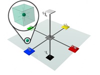
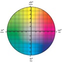 To tolerance in Delta L*a*b*, you first define a difference limit for Delta L* (lightness), Delta a* (red/green), and Delta b* (yellow/blue). These limits create a rectangular tolerance box around the standard. In this example, the target is a relatively dark (42.65) shade of greenish/blue. Both a* and b* are negative, placing it in the green/blue quadrant.
Next, you create a limit for how much color difference is acceptable. This image shows a tolerance of one unit each of L*, a* and b*, which forms a box around the target color. Once you create the tolerance, any sample measurement that falls within the box is acceptable, and any sample that falls outside the box is rejected.

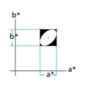 This diagram shows the acceptable tolerance as a square, and the visually accepted color as the ellipsoid. You can see the problem - a box-shaped tolerance around the ellipsoid can give good numbers for unacceptable color. On the other hand, if you create a tolerance box that is small enough to fit within the ellipsoid, you can fail visually acceptable color.
The Delta L*a*b* color model is quite arbitrary because it doesn’t really capture the way we perceive, describe and communicate color. While humans are good at communicating the light-dark element, red-green and blue-yellow are harder for us to describe.
DE* = CIELab Delta E
Delta E is the total distance or difference between two colors. In our earth analogy, think of it as the total distance between two cities.
Delta L*C*h° (aka CIELCH)
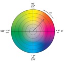 Tolerancing in Delta L*C*h° isn’t much different than tolerancing in Delta L*a*b*. A color can move up or down in L – that’s in or out of chroma – and clockwise or counter-clockwise in hue. But in Delta L*C*h°, the amount of acceptable error is Delta L, Delta C and Delta H instead of Delta L, Delta A, and Delta B.
The images below show the same bluish/green point on the same color plane. This time, however, the color is identified using Delta L*C*h° terminology. The limits are specified just like with Delta L*a*b*, but here the color’s allowable error range is established in terms of lightness, hue, and chroma.
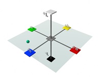
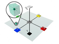
Remember how the Delta L*a*b* tolerances yielded a cubic shape? Delta L*C*h° forms more of a “slice” in than a cube around the target to better correlate with human vision. While the Delta L*C*h° color model is more intuitive, most specifications call for measurements in Delta L*a*b*. In fact, today’s instruments and software slip easily from one model to the next.
DECMC = Delta E CMC
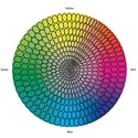 Delta E CMC tolerancing is based on Delta L*C*h°, but provides better agreement between visual assessment and measured color difference. The CMC calculation mathematically defines an ellipsoid around the standard color with semi-axis corresponding to hue, chroma and lightness. The ellipsoid represents the volume of acceptable color and automatically varies in size and shape depending on the position of the color in color space.
As you can see, the ellipsoids in the orange area of color space are longer and narrower than the broader and rounder ones in the green area. The size and shape of the ellipsoids also change as the color varies in chroma and/or lightness.
The CMC equation allows you to vary the overall size of the ellipsoid to better match what is visually acceptable. By varying the commercial factor (cf), the ellipsoid can be made as large or small as necessary to match visual assessment.
Since the eye will generally accept larger differences in lightness (l) than in chroma (c), a default ratio for (l:c) is 2:1. A 2:1 ratio will allow twice as much difference in lightness as in chroma. The CMC equation allows this ratio to be adjusted to achieve better agreement with visual assessment.
DE94 = Delta E 94
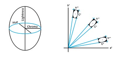
In 1994 the CIE released a new tolerance method called CIE94. Like CMC, this tolerancing method also produces an ellipsoid, but you can control of the lightness (kL) to chroma (Kc) ratio, as well as the commercial factor (cf). These settings affect the size and shape of the ellipsoid in a manner similar to how the l:c and cf settings affect CMC.
However, while CMC is targeted for use in the textile industry, CIE94 is more commonly used in the paint and coatings industry. You should consider the type of surface being measured when choosing between these two tolerances. If the surface is textured or irregular, CMC may be the best fit. If the surface is smooth and regular, CIE94 may be a better choice.
DE00 = Delta E 2000
The formula for Delta E 2000 uses the most advanced math available today and provides the best agreement to the human eye. Although it fixes the lightness issue with DE94, it’s not without fault, especially when comparing hues that are 180° from each other.
How to choose the right method
Although no color tolerancing system is perfect, the CMC and DE2000 equations best represent color differences as our eyes see them. When deciding which method to use, consider the following five rules from Billmeyer (1970 and 1979):
- Select a single method of calculation and use it consistently.
- Always specify exactly how the calculations are made.
- Never attempt to convert between color differences calculated by different equations through the use of average factors.
- Use calculated color differences only as a first approximation in setting tolerances, until they can be confirmed by visual judgments.
- Always remember that nobody accepts or rejects color because of numbers. It is the way it looks that counts.
Check out our other tolerancing blogs for more information, or get in touch to speak with a Color Expert who can help you chose the best method for your needs.
To learn more about tolerancing, check out these additional blogs:
