

Maintaining color consistency across global supply chains is one of the biggest challenges facing brands and packaging printers today. Whether you're producing folding cartons, flexible packaging, or labels, color variation can happen at any stage — from design to final production. But why does this happen, and more importantly, how can you fix it? Where Does Color Go Wrong? At the start of every print project, color expectations are set. Unfortunately, this is often where problems begin. ...
Posted April 17, 2025 by X-Rite Color

Color is a powerful tool in print and packaging, influencing consumer decisions and defining brand identity. Whether you’re designing luxury goods or everyday products, accurate color ensures your materials stand out while maintaining brand consistency. However, achieving accurate color can be challenging, especially for those who rely solely on visual evaluation. Let’s explore how controlled lighting improves color perception and why it’s essential for effective visual color ...
Posted February 24, 2025 by X-Rite Color

The Need for Industry Standards for Visual Color Evaluation in Retail LED Lighting In the retail industry, lighting is a critical factor that influences how products are perceived by customers. However, the lack of standardized LED lighting poses significant challenges that can impact both retailers and consumers. Inconsistent Color Reproduction One of the primary issues with the absence of standardized LED lighting is inconsistent color reproduction. Different LED lights can produce varying co...
Posted February 11, 2025 by X-Rite Color

Moving from Fluorescent to LED Light Booths for Color Evaluation: How the EU’s Ban Drives Innovation
The Future of Color Consistency: LED Lighting Solutions for Industry Standards For years, fluorescent bulbs have been a mainstay in industries requiring accurate color assessment, but their downsides are becoming increasingly hard to ignore. These lights require warm-up time and may distort color accuracy, both of which lead to production delays and translate into higher sample costs. More importantly, fluorescent bulbs contain hazardous materials like mercury, complicating their disposal...
Posted November 28, 2024 by X-Rite Color

Brands may not have a line item in their budget for color, but it can impact the bottom line in different ways. Understanding the true cost of color can help accelerate go-to-market, reduce waste, and save thousands. Color plays a big role in purchase decisions when you consider it only takes shoppers 2 to 7 seconds to select an item from the shelf. To stand out, brands must introduce interesting designs to launch new varieties and seasonal specials, while considering the impact new packaging wi...
Posted November 12, 2024 by Cindy Cooperman

Originally published May 3, 2024 from https://canmaker.com/light-touch/ Industry stakeholders came together to explore ink and proofing standards for two-piece beverage cans. Nisa Ali reports from Manchester Leading companies across canmaking industry supply chains are considering general guidance for PantoneLIVE colours in the production of two-piece beverage cans. Following a series of seminars discussing the role of PantoneLIVE colour libraries in the design, proofing and printing process ...
Posted October 29, 2024 by X-Rite Color
.jpg?h=350&la=ja-JP&w=700&hash=CA624EFD0159F6CF9AA520622C57B64BB029E15D)
Brands invest a great deal of time and resources when selecting a new color to represent their products. If the color doesn't match expectations after printing, runs are wasted, and everyone is left wondering where the color went wrong. Here's a typical scenario. A brand selects a season color for product packaging and communicates that color to the designer. The designer integrates the color into the design and hands it off to the premedia team to convert it into print-ready files. The files a...
Posted September 13, 2024 by X-Rite Color

Originally published May 3, 2024 from https://canmaker.com/light-touch/ Industry stakeholders came together to explore ink and proofing standards for two-piece beverage cans. Nisa Ali reports from Manchester Leading companies across canmaking industry supply chains are considering general guidance for PantoneLIVE colours in the production of two-piece beverage cans. Following a series of seminars discussing the role of PantoneLIVE colour libraries in the design, proofing and printing process ...
Posted August 26, 2024 by X-Rite Color

電機・電子機器に含まれる特定有害物質の使用制限に関するEU指令の最近の改定により、2025年2月24日までに、特殊用途向けの多くの蛍光灯に適用されている水銀に関する、現行の適用除外が撤廃されます。これらは、EU REACH規則の条項 2(b)(4)-Iで定義されています。適用除外撤廃後、欧州では、この適用除外に基づく蛍光灯のテクノロジーを含む新しい機器の販売は出来なくなります。 現在、エックスライト製の標準光源装置 SpectraLight QCに搭載されている蛍光灯は、このカテゴリの適用除外に該当します。 この規制に対応するため、当社は欧州におけるSpectraLight QCの販売を2025年2月24日以降停止しますが、適用除外撤廃後もサービスと交換部品でのサポートは規制の対象とならないため、販売を継続いたします。 この決定を受けて他の地域の国々も、欧州の規制に合わせると予想されます。近い将来、市場ではあらゆる種類の蛍光灯の販売が禁止されるでしょう。 こうした規制強化と、それに伴う蛍光灯製造の縮小により、蛍光灯の供給と調達はより厳しくなり、サプライヤーは蛍光灯の生産を集約しています...
Posted February 12, 2024 by X-Rite Color

The internet is full of Top 10 Countdowns. We enjoy looking back at our most popular blogs and learning resources to better understand what interests you – our readers. We’ve been publishing our top-read learning resources since 2016, and we’re happy to see some educational topics like color perception, tolerancing, and spectrophotometers continue to rank year after year. Here’s a list of the topics our readers enjoyed most in 2023. Have you read them all? Top 5 X-Ri...
Posted February 02, 2024 by X-Rite Color

The environmental footprint of fashion is out of control. According to the National Resources Defense Council (NRDC), “Textile mills generate one-fifth of the world's industrial water pollution and use 20,000 chemicals, many of them carcinogenic, to make clothes.” Fabric being dyed in factory. Image from NRDC.org. A Problem That Impacts Everyone Did you know it takes about 200 tons of water (enough to fill several swimming pools) to produce one ton of cott...
Posted April 12, 2023 by X-Rite Color

If ensuring color consistency is part of your job description, you’ll want to learn more about PantoneLIVE. Our customers report that it helps them get products to market an average of four times faster! PantoneLIVE is an end-to-end, digital color communication ecosystem that helps everyone involved in a packaging workflow visualize and communicate color. It shows which colors are achievable, and which are not, across everything from flexible packaging to corrugated board. And, since the digital...
Posted March 15, 2023 by X-Rite Color
.jpeg?h=285&la=ja-JP&w=400&hash=0485F951BB453A5CED540FCCEBC8BE8F09421933)
When all of final production packaging comes together on the store shelf, it’s a brand’s moment of truth. Do the stand-up pouches, overwraps, and corrugated POP displays match? How close is the color to its standard? We know you spend so much time and money designing, proofing, sampling, printing, and shipping… so where does the color go wrong? Is it an issue with accuracy, consistency, or both? Package designs come together on the shelf. Here you see pouches, labels, cartons, and corrugated wit...
Posted March 15, 2023 by Cindy Cooperman

What happens when you have more than 2,000 brand colors to manage across a complex global packaging supply chain? Things get complicated! Although it may seem easier to create a new color than to dig through databases or binders of color drawdowns to find the closest match, the problem comes later when you’re faced with a huge, unmanageable library. One of our clients, a well-known fast-moving consumer packaged goods (FMCG) company, understands how easily things can get out of control. They wer...
Posted March 15, 2023 by Cindy Cooperman

皆様の色の品質管理の工程には、目視評価が含まれていますか? もしそうでないなら、含めた方が良いでしょう。 標準光源装置SpectraLight QCを目視評価ワークフローの一部として使用 どの業種でも、色の評価は、測色計でサンプルを測色するだけではありません。測色計は色を許容範囲内だと表示していても、その結果は必ず人間の目に正しく見えるとは限りません。 顧客からの拒否を最小限に抑えるには、色管理プロセスに照明ブースでの視覚評価を含める必要があります。特に、同じ製品の異なるパーツを生産する場合です。なぜなら、工場内だけでなく、屋外や蛍光灯のある店舗など、世の中にどこで見られても、色の統一感が必要だからです。 本日は、皆様の品質管理の工程を、可能な限りレベルアップするために、目視評価するための10のヒントを紹介します。 目視評価に欠かせない標準光源装置を使用 エックスライト社製の標準光源装置SpectraLight QCは、さまざまな光源の下で色を評価・比較するための制御された環境を提供します。ここでは、標準光源装置の導入によって、色評価の工程を最大限に活用するための 10 のヒント...
Posted March 15, 2023 by X-Rite Color
.jpg?h=285&la=ja-JP&w=400&hash=2BB6CFDBCF85E21659AD201B3F207B65B1F89A45)
ブランドカラーの選定や、新製品ラインのパレット作成、季節のパッケージデザインなどのとき、色選びにはインスピレーションが不可欠なものとなります。
インスピレーションは日常の生活から得られます。
パーティー
食料品店
スポーツイベント など
そして、もちろん、自然です。母なる自然は、最も美しいカラーパレットを生み出すコツを知っています。
「2022/2023年秋冬の色彩は、安らぎと回復をもたらす色彩と、活力に満ちた色調を組み合わせることで、私たちが求める穏やかさや快適さと、エネルギーを高める活力を対比させています」と、Pantone Color InstituteでのエグゼクティブディレクターのLeatrice Eiseman氏は述べました。「矛盾に満ちた環境へ進む中、2022/2023年秋冬の色相は、消費者が対照的な色合いの間を流動的に移動することができ、その日の自分らしさや気持ちをのびのびと表現できるようにします」と述べています。
デザインナーはこうしたトレンドを意識して、消費者を惹きつける色合いの異なるパレットやコーディネートカラーを作成する必要があります。
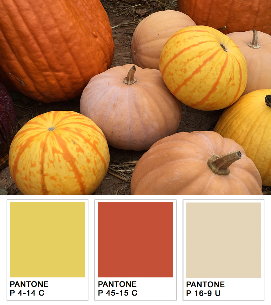
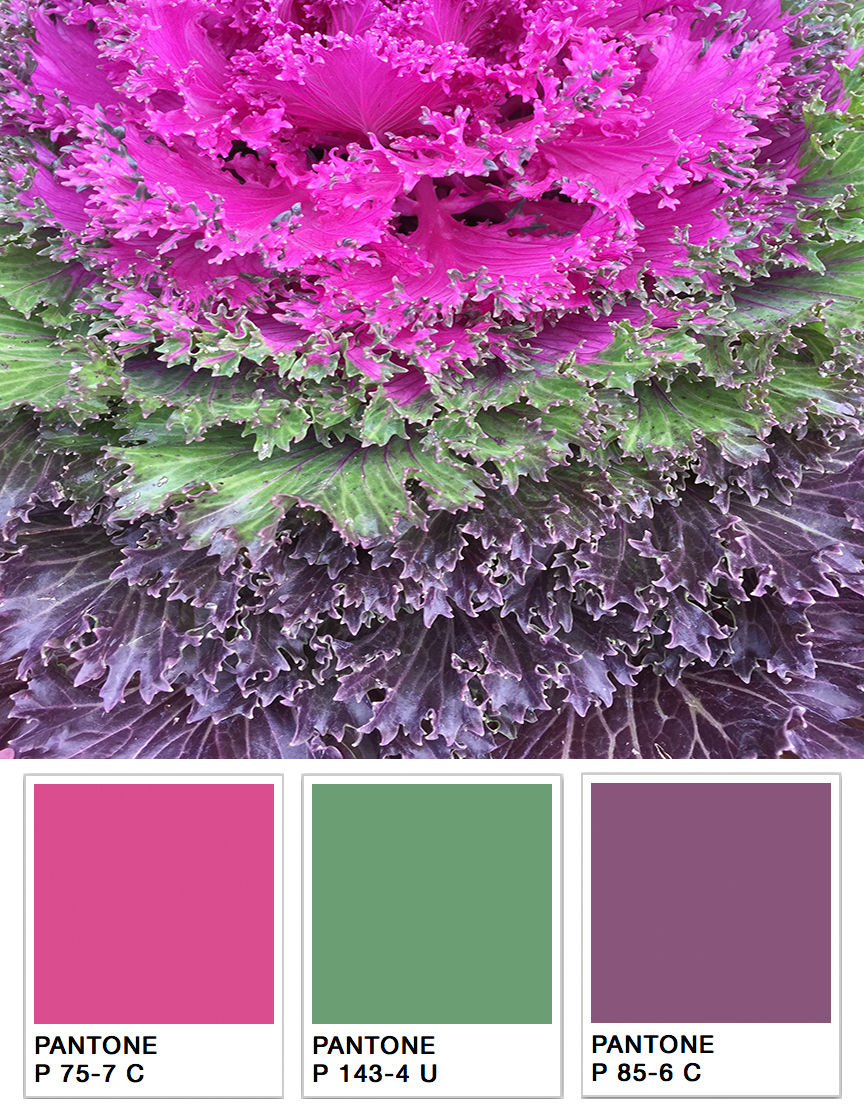
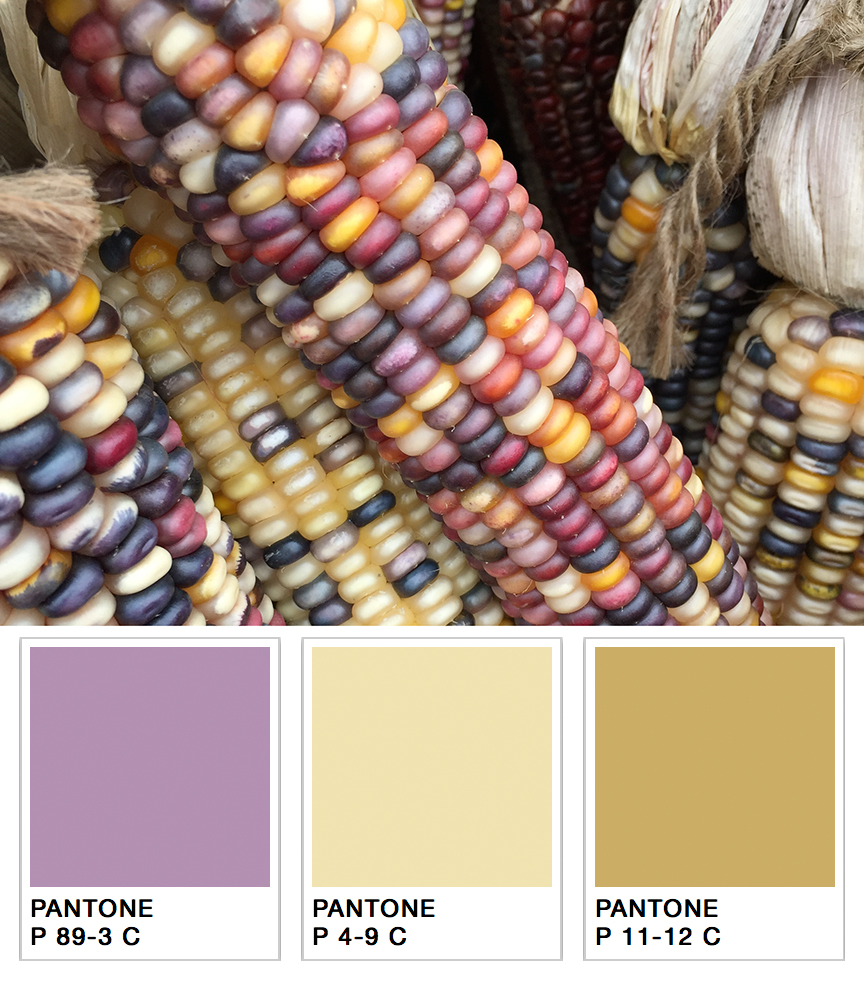
例をあげましょう。あなたは来秋の製品パレットを決めるタスクを任されて、ちょうどアディロンダック地方に1週間のハイキングに出かけるところだとします。山肌を覆う美しい紅葉や紫、赤、黄色など。そして、鮮やかなマム、パンプキン、ひょうたんが、あらゆる色合いのオレンジ色で小さな町を埋め尽くしています。これらの色をすべて覚えていて、スタジオで再現することができますか?
おそらく無理ではないでしょうか。
人間は200万色以上の色を識別することができますが、色の記憶は非常に乏しいです。「1分前に見た色を再現してください」と言われても、ほとんどの人が失敗してしまいます。
しかし、ポータブル分光測色計を持っていけば、その問題が起きません。さらに、スタジオに持ち帰れば、さまざまな色調を簡単に再現することができます。小型で高性能な分光測色計があれば、デザインナーはいつもどこでも便利に色のインスピレーションを得ることができます。
カラーマッチングツールの使用方法
エックスライトのCAPSURE デバイスで、インスピレーションからパレット仕様に移行するのに、以下の簡単な3つのステップをご紹介します。
- 校正されたCAPSUREを測定したい対象物に当て、ボタンを押します。CAPSUREは、あらゆる質感やパターンを測定することができます。
- CAPSUREはその色の数値を制作に記録し、あなたが選んだファンデッキ、どれでも最も近い色の一致を確認します。これを各オブジェクトに対して、繰り返す作業です。
- 撮影が終わったら、すべての美しい色を評価し、気に入った色を選び、Pantone仕様のデザインパレットを作成します。

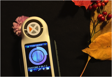
ポータブル型の色識別・調色ツール
多用途
CAPSUREは、平面上の色を正確に読み取り、関連するカラーライブラリの中から最も近いものを見つけます。CAPSUREは軽量で、使いやすいです。デザインナーがコーディネートカラーを見つけるためサポートするデバイスだけでなく、ペンキ屋の店員まで最小限のトレーニングを受けるだけても、お客様が求めている壁、カーペット、家具、フローリング、衣類などの 色合わせの探し にも活用できます。
便利性
CAPSUREは、ハーモニーパレット、類似色、カラーナビゲーションの機能により、お客様の選択とデザインプロセスのために、推奨色を提供し、さらなるインスピレーションの求める場面に最適です。また、コーディネートカラーや補色パレットを開発するために、多色パターンの中の色を分離することができます。色情報を記録・保存してアクセントカラーの選定に利用したり、ダウンロードして店頭での調色に利用することもできます。
利用性
- 測定前にサンプルをプレビュー。ズームインして特定のエリアを手動で選択したり、詳細で多色なサンプルから主な色合いを自動的に特定することができます。
- USB充電池で駆動・軽量でどこにでも持ち運び可能です。
- 最大100の測定値を保存でき、内蔵マイクで各色の音声記録を作成できます。
- 独自のワンクリック・カラー識別システムにより、色成分を正確に識別し、カラーコレクション間のベストマッチを素早くクロスチェックできます。
- 保存した色を呼び出してカスタムパレットを作成し、一般的なデザインアプリケーションで選択を統合することができます。
Posted November 04, 2022 by X-Rite Color
.jpeg?h=285&la=ja-JP&w=400&hash=B68E8C442BE87DD22FD7684E788CE9480FCF698C)
色は大事だと、よく言われています。なぜ大事なのか知っていますか。実際、生産工程において、色はとても重要な要素です。しかし、残念ながら、多くのメーカーは、色を正しく表現することが以前と比べ、はるかに難しくなったと気づいています。なぜなら、取引先のブランドは、より厳しい許容範囲を満たすことを求めています。 その理由の一つは以下のとおりです。 メタリックパッケージ、真珠光沢仕上げ、カスタムファブリック、鮮やかな新色など、色技術の進捗は顧客を魅了する一方で、生産における一貫性を持たせることがより難しくなっています。 たとえば、コンポジットデッキを例としてあげましょう。以前はグレーかブラウンの2択しかありませんでした。そして、デッキ全体に調和が取れていけば、お客様は十分満足されました。しかし、今では、深い木目模様やエキゾチックな色など、多くの選択肢があります。そのため、メーカーは2~3色ではなく、数10色を管理しなければなりません。統一感を出すために、より難しくなりました。 パッケージもそのひとつです。かつて、印刷された箱のみが並んでいたお店でも、今はホイルパウチやブリスターパック、マルチ基...
Posted November 01, 2022 by Cindy Cooperman

There are many things that affect our ability to see color. In some cases, it doesn’t matter if the red you see is the same shade I see. A barn is a barn, right? But for those who work in an industry where color evaluation is part of the job, it IS important… VERY important. In our color perception series, we’re discussing the many factors that affect how we see color and what colorists can do to ensure that the color they see is the color they are supposed to see. Today we’ll take a closer look...
Posted August 31, 2022 by X-Rite Color

As the temperature of light changes, so does our perception of color. As I mentioned in our last post, light plays a huge role in the way we perceive color. Today we’ll look at the science of color in manufacturing and photography; specifically how an object’s reflective and absorptive properties and viewing technology can impact the colors we perceive. To reflect or not to reflect… that is the question. The colors an object absorbs and reflects is determined by its material – is it metal, plas...
Posted August 31, 2022 by X-Rite Color

According to autolist.com, over 80% of cars produced today are white, black, or some shade of gray. It’s not necessarily because bright and bold colors are more difficult to produce and match than their grayscale counterparts, they just take longer to get through the inspiration and car design process. Believe it or not, producing a new auto color can take up to five years before it makes it to the showroom floor. It’s a long, tedious process for designers, paint...
Posted June 27, 2022 by X-Rite Color

L&E International, Ltd is a global provider of sustainable, innovative packaging solutions. As a certified packaging supplier for adidas, Verizon, Amazon (APASS vendor in Asia), Target, and many other brands and retailers, L&E maintains and upholds strict brand color standards across multiple countries and locations of manufacture. Last year, L&E selected X-Rite digital color workflow solutions to maintain their high color matching expectations. We are excited to be working wit...
Posted June 06, 2022 by X-Rite Color

As the range of substrates, inks, and printing technologies has expanded, so has the challenge of maintaining color quality for brands and printers. A workflow based on digital standards is the easiest way to achieve accuracy and consistency across shifts and sites, regardless of production requirements. Adding a quality control solution like ColorCert® to your workflow can boost your bottom line even more. What is ColorCert? ColorCert is a modular, job-based solution that streamlines color ...
Posted April 26, 2022 by X-Rite Color

Light booths provide a controlled environment for judging color under different lighting conditions. They can help visually evaluate how different types of light will affect the perception of color, evaluate the color of raw materials before and after production, and ensure different components will remain uniform once they’re assembled. But not all light booths are the same. With NIST traceability and ISO 17025 accreditation, X-Rite offers worldwide competence in calibration, cert...
Posted December 13, 2021 by X-Rite Color

The best way to visualize how color will react in real world lighting conditions is to use a quality light booth. Traditional light booths contain common illuminants like daylight, incandescent, and fluorescent to replicate how color will look in the retail store and post-purchase in outdoor and home lighting. Today, the increased use of LED lamps in home, commercial, and retail environments is impacting decades of standardized lighting procedures. How LED is Changing the Game LED li...
Posted November 03, 2021 by X-Rite Color

測色は、色の重要な作業において、色の品質を指定・定量化・伝達・定形化・検証するために必要です。色の感じ方は人それぞれ異なるため、測色は目視評価より正確な結果を得られます。 色測定とは? 色測定は、サンプルによって放射・透過・反射される光の量をとらえ、スペクトルデータとして定量化することで、光源の変化分も捉えることが出来ます。測色計(分光測色計)で行う色測定は、目視評価より正確です。なぜなら、人間の色認識は差を表すのは得意ですが、定量的に示すことは不得意です。色に関わる重要な作業には、色を識別・定量化・伝達・区別するための分光測色計の導入を強く推奨します。 色波長の測定方法 色を測定するには、分光測色計と呼ばれる測色装置でサンプルに光を当て、人間の目に見える波長範囲である380nmから780nmの範囲で透過または反射した光の量をとらえます。分光測色計は波長範囲にわたるスペクトル波長測定に基づき、計算を行い、スペクトルデータを定量化します。 測色計とは? 測色計には、色彩計と分光測色計の2種類あります。 色彩計は人間の目と同じように色を認識し、赤・緑・青を感じる3...
Posted August 24, 2021 by X-Rite Color

Learn about light, reflection curves, optical brighteners, and more. Illuminants Electro magnetic radiation in the wavelength range from 380 nm to 730 nm is seen as light by our eyes. Low wavelengths show as blue light, then the spectrum continues from green to yellow, orange, and red. UV radiation is located in the range below 380 nm; the range above 730 nm is called infrared radiation. The visual impression of a colored body changes by the composition of the incoming light. ...
Posted July 22, 2021 by X-Rite Color

COVID-19 has forced many companies to rethink the way they communicate, approve, and produce color. For some, that means trying to conduct “business as usual” from a remote location. For others, it means finding ways to manage color without travel. Either way, we know our customers are doing everything they can to sustain business while keeping their employees healthy and safe. We want to help. Over the past few months we’ve been adding new resources to our virtual resou...
Posted December 15, 2020 by X-Rite Color

The Pantone Color of the Year announcement is always exciting. Not only does it set the stage for upcoming trends, it also provides brand owners and designers critical guidance for marketing and product development. However, those who are charged with manufacturing products and packaging with trending colors (like 2021's Ultimate Gray and Illuminating) know it doesn’t “just happen.” It takes time and effort to incorporate new colors. Whether you work in paints, plasti...
Posted December 14, 2020 by X-Rite Color

The Pantone Color Institute just announced PANTONE 17-5104 Ultimate Gray + PANTONE 13-0647 Illuminating as the Pantone Color of the Year 2021. According to the Pantone Color Institute, PANTONE 17-5104 Ultimate Gray + PANTONE 13-0647 Illuminating, a marriage of color conveying a message of strength and hopefulness that is both enduring and uplifting. Illuminating is a bright and cheerful yellow sparkling with vivacity, a warming yellow shade imbued with solar power. Ultimate Gray is emblematic of...
Posted December 14, 2020 by X-Rite Color

Recently we had the opportunity to sit down with Laura Guido-Clark, a consumer products designer of color, material, and texture. She has been dubbed an “Experience Consultant,” which reflects her interest and study of human reactions to the look and feel of new products. Photo by Laura Flippen. We asked Guido-Clark to speak with us because we also appreciate the importance of color in our lives. Q. What inspired you to pursue a career in color? A. When I wa...
Posted September 01, 2020 by X-Rite Color
