Density only tells us one thing about a color – how light or dark it is. To compare and communicate accurate color in print and packaging, you also need to measure hue and saturation.
Today we’ll take a look at the two most commonly used color models: CIELAB and L*C*h°, and the tolerancing methods that help us describe color difference.

The concept behind CIELAB and L*C*h° is similar to longitude, latitude and altitude … with three coordinates, you can describe the exact location of any place on our planet (or in this case, any color in color space).
CIELAB
CIELAB is a model that navigates through a grid-like color space containing all of the colors we can see. The correct way to pronounce it is “see-lab”, or “L-star, a-star, b-star,” but some applications and instruments simply call it L, A, B, or Lab.
The CIELAB color model has a vertical L axis that represents lightness. It moves from white at the top to black at the bottom. Lighter colors have higher values, and darker colors have lower values. Looking from the top, you can see the horizontal A and B axes. The reds fall in positive A, and greens in negative A. Yellows are positive B and blues are negative B. Using numbers for L, A, and B, the location of a color can be specified within this 3-dimensional space.

This cyan has L*a*b* value of 42.65, -25.29, -28.16. It can be located in CIELAB by moving up the L axis to 42.65, then in the negative direction in the A axis to -25.29, then in the negative direction in the B axis to -28.16.
L*C*h°
In the L*C*h° color model, L for stands for lightness, C for chroma, and H for hue. Just like CIELAB, the lighter the color, the higher the value. Hue describes the color family – red, yellow, green, and blue – and all of the colors that fall in-between. The numbers in a hue circle range from zero to 360, starting with red at zero degrees, then moving counter-clockwise through yellow, green, blue, then back to red.
Chroma, or saturation, describes where a color falls between the center and the edge of the sphere. Lower numbers near the center are more gray and have very little chroma, while higher numbers are more pure and saturated.
Both models can be used to describe the same color. The L*C*h° color model is more intuitive, but most specifications call for measurements in CIELAB.
Tolerancing
To control color, you need to be able to identify small differences, or variations, in your color reproduction. Setting a tolerance means choosing the limit for how much difference is acceptable between a target color and its production values. Printers often follow the tolerances ISO has established for solid ink colors. Alternatively, clients may provide tolerances, especially for logo and spot colors.
When comparing two color values in CIELAB or L*C*h°, the difference is described as a delta. A mathematical equation is used to find the difference between two colors using all three values: L*, a* and b*, or L*, C* and h°. This is called delta E (also written DE or ∆E). A delta E of 1.0 is generally accepted as the smallest color difference that the human eye can see.
The tolerance you choose depends on the production process. Color-critical work, such as company logos, will have a tighter tolerance, while a graphic design on a highway billboard will probably allow more room for error. Sometimes a customer’s print specs stipulate the acceptable difference in a color’s lightness, and limit the difference from red to green and yellow to blue. In other words, they may specify a different ∆L*, a ∆C*, and ∆h°, or a different ∆L*, ∆a*, ∆b*.
You also need to consider repeatability of the press when setting the tolerance…It can’t be smaller than the variation your press normally achieves through a press run.
Delta E came into play in 1976. Since then, we’ve realized that the human eye can see some colors better than others. For instance, if we add just a small amount of blue to light gray, we can see a slight shift in the color. But if we add that same amount of blue to a very chromatic purple, we won’t even notice the change.
Other tolerancing formulas have been developed that take this into consideration. CMC, CIE94, and CIE2000 all attempt to compensate for CIELAB’s weaknesses. The math is more complicated, so we won’t go into it here, but the point is that all give different results that more closely resemble the way we really see color differences.
Choosing the best tolerancing formula for your needs
If you’re matching a specification or standard, use the delta E that is specified in the standard.
If your client specifies a spot color and requires a certain delta E match, ask which formula so you can use it. If you don’t select the right one, you might fail some work that should be passed, or your client may reject work that you measured as acceptable.
If you’d like to learn more about color theory, check out our Color Theory: The Numbers of Color eLearning course.
Featured Color Management Solutions
Learn more about these featured products:

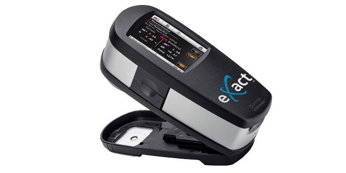
eXact
The new eXact combines industry-leading functionality with an easy-to-use interface to deliver the best solution yet for controlling, managing, and communicating color across the entire color workflow.
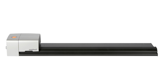
IntelliTrax2
Scan the color bar on a typical press sheet in less than 10 seconds. IntelliTrax2 is the ideal color management solution for high-end, high-speed printing/converting operations.


