
Per ottenere una misurazione del colore precisa e coerente, è essenziale investire in uno spettrofotometro di alta qualità. Gli spettrofotometri sono fondamentali per la qualità del colore perché forniscono dati ripetibili e affidabili che garantiscono la conformità dei prodotti a rigorosi standard cromatici. Che si tratti di produzione di beni durevoli, abbigliamento, cosmetici o materiali per l'edilizia, lo spettrofotometro giusto può fare la differen...
Posted March 11, 2025 by X-Rite Color

Abbracciare soluzioni ecologiche per un domani più radioso In un mondo in rapida evoluzione come quello odierno, la sostenibilità è diventata un aspetto cruciale per i produttori di diversi settori. Con l'aumento della consapevolezza ambientale dei consumatori, è cresciuta la domanda di pratiche sostenibili nella produzione. Questo spostamento verso la sostenibilità non solo porta benefici al pianeta, ma migliora anche le operazioni aziendali, portando a...
Posted March 10, 2025 by X-Rite Color

L'esigenza di standard di settore per la valutazione visiva del colore con l'illuminazione a LED in ambito retail Nel settore retail, l'illuminazione è un fattore critico che influenza la percezione dei prodotti da parte dei clienti. Tuttavia, la mancanza di standard per l'illuminazione a LED pone sfide significative che possono avere un impatto sia sui rivenditori che sui consumatori. Riproduzione del colore incoerente Uno dei problemi principali dell'assenza di standard per l'illumin...
Posted February 11, 2025 by X-Rite Color

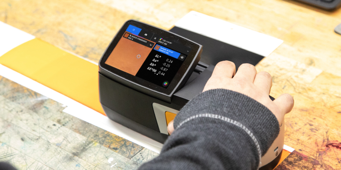
Perché la retrocompatibilità degli spettrofotometri è fondamentale per un colore coerente Se sei arrivato fin qui, è probabile che utilizzi uno spettrofotometro da banco per avere sempre una qualità del colore ottimale. Da tessuti e plastica a vernici, rivestimenti e altro ancora, questi strumenti di alta precisione sono fondamentali per mantenere l'uniformità nei tuoi processi. In X-Rite, progettiamo spettrofotometri per garantire prestazioni affidabili...
Posted October 28, 2024 by Tim Mouw

Sei alla ricerca di una sede centrale per gestire i prodotti e servizi X-Rite? Dai un’occhiata a My X-Rite. Il nostro portale online gratuito è raggiungibile con pochi clic per darti tutto quello che cerchi: assistenza e informazioni sul prodotto, dettagli sui servizi e accesso alle risorse di apprendimento. Accesso 24/7: per accedere facilmente alla tua dashboard personale direttamente dal computer o dispositivo mobile, 24 ore su 24. Dashboard personalizzata: guarda que...
Posted April 25, 2024 by X-Rite Color

In the sign and display graphics business, as in many other segments of the printing industry, shorter runs and reduced cycle times can stress even the most efficient wide format printing operations. By implementing a color-managed RIP-to-roll (or RIP-to-rigid media) workflow, these operations can ensure that color is right the first time and every time to help speed work through the shop and meet color expectations. Photo by Peter Saunders Today we are share tips from our Color Experts that c...
Posted April 23, 2024 by X-Rite Color

Cosa succede se devi gestire più di 2.000 colori dei brand in una complessa filiera di produzione globale del packaging? Le cose si fanno complicate! Anche se al momento può sembrare più facile creare un nuovo colore che cercare nei database o nei raccoglitori di drawdown per trovare la migliore corrispondenza, il problema si ha in seguito, quando ti ritrovi con una libreria enorme, ingestibile. Uno dei nostri clienti, una nota azienda del settore FMCG (beni di largo consum...
Posted March 15, 2023 by Cindy Cooperman

Does your quality control program include visual evaluation? If not, it should. Using the SpectraLight QC as part of a color evaluation workflow. No matter your industry, judging color is more than just measuring samples with a color measurement device. Just because a spectrophotometer says your color is within tolerance, doesn’t necessarily mean it will look right to the human eye. To minimize customer rejects, your color control process needs to include visual evaluation in a light boo...
Posted March 15, 2023 by X-Rite Color

In questo periodo dell’anno, Internet riporta in abbondanza elenchi di top 10. Una tradizione accolta sin dal 1940, quando Billboard pubblicò la prima classifica dei dischi più venduti. Da allora, in molti hanno iniziato a pubblicare classifiche analoghe, per evidenziare le tendenze più popolari dell’anno precedente. Dal 2016 pubblichiamo la classifica dei post più letti nel nostro blog, e siamo lieti di vedere che ogni anno, nelle prime posizioni...
Posted December 28, 2022 by X-Rite Color

It’s important to ensure design intent is realized each time and everywhere a product appears. But with so many variables to impact print quality, how can brands utilize suppliers around the world and still achieve consistent color? Our X-Rite Pantone Packaging Color Experts have designed a series of consulting services and workshops to help you get the most from your print, packaging, plastic or textile value chain. Offered both online and onsite, these interactive sessions i...
Posted December 06, 2022 by Cindy Cooperman
.jpeg?h=285&la=it-IT&w=400&hash=E9A3E267811AFF59A4193484FB7CBD292CC833E2)
Sostieni che il colore è importante, ma ne conosci a fondo importanza? In realtà, il colore è un elemento fondamentale nel processo di produzione. Oggi, molti produttori si rendono conto che ottenere il colore esatto è molto più complicato di quanto fosse in passato, e ricevono richieste di tolleranze più rigorose dai brand owner che supportano. Ecco perché. Se i progressi nella tecnologia del colore – p.e., packaging metallici, finiture pe...
Posted November 01, 2022 by Cindy Cooperman

I clienti alle prime armi in materia di gestione del colore spesso ci domandano: "Qual è la differenza tra uno spettrometro e uno spettrofotometro?". Dal punto di vista ortografico, la differenza è minima ed è, quindi, facile confondersi e ottenere la risposta sbagliata a questa domanda. E allora, qual è la differenza? Spettrometri e spettrofotometri a confronto Cos'è uno spettrofotometro? Uno spettrofotometro è un dispositivo di misurazion...
Posted September 13, 2022 by X-Rite Color

Quante prove ed errori vi occorrono per formulare un colore? Se la risposta è più di tre, potrebbe essere il momento di ricorrere all'aiuto di una soluzione computerizzata. La formulazione del colore assistita dal computer può portare enormi vantaggi alla vostra attività. Anche i principianti possono raggiungere più rapidamente gli obiettivi cromatici, risparmiando tempo, denaro e coloranti costosi. Una volta stabilito un metodo accurato, potete aspettarvi di s...
Posted July 07, 2022 by Mike Huda

Con un numero sempre maggiore di marchi di beni di consumo (CPG) che implementano programmi di controllo della qualità degli imballaggi per monitorare le tolleranze cromatiche, i trasformatori e gli stampatori di imballaggi hanno bisogno di soluzioni di misurazione del colore che si integrino direttamente con i sistemi di reporting. Le nostre soluzioni di scansione IntelliTrax2 Pro e eXact Auto-Scan Pro combinano la potenza dei nostri dispositivi di scansione automatica leader del settore con la...
Posted April 06, 2022 by Christian Benz

X-Rite acquired GretagMacbeth in 2006, making most GretagMacbeth handheld and benchtop spectrophotometers 20+ years old. If you're still using one of these legacy spectrophotometers and color consistency is important to your business, we encourage you to consider upgrading to a new, ISO-certified X-Rite device for the best experience. Here at X-Rite, we continue to research and improve our color measurement technology so our customers can meet tighter color control tolerances. Improved color mea...
Posted March 28, 2022 by X-Rite Color

In un mondo ideale, dovresti poter installare gli inchiostri sulla macchina da stampa ed eseguire il lavoro. Sfortunatamente, ogni anno i laboratori di stampa rotocalco e flessografica sprecano inchiostro, substrati e tempo cercando di ottenere i colori giusti. Nonostante sia più facile ottenere colori precisi grazie ai progressi tecnologici, ci sono ancora variabili che influiscono sul colore.

In questa serie in tre parti, ti forniamo più di due dozzine di motivi per cui il colore potrebbe non essere giusto in macchina. Leggi il primo articolo dedicato agli strumenti se te lo sei perso.
Oggi vediamo come standard e inchiostri possono influire sul colore finale.
1 - Utilizzo dello standard cromatico sbagliato.
È facile selezionare lo standard cromatico sbagliato nel software. Alcuni sistemi hanno centinaia, se non migliaia, di standard cromatici. Ecco qualche consiglio:
- Assicurati che lo standard che selezioni abbia le stesse caratteristiche del lavoro che stai stampando.
- Organizza gli standard per cliente e includi informazioni come substrato, cilindro retinato, sistema di inchiostri, ecc.
- Immetti lo standard con le impostazioni corrette per lo strumento e il materiale di supporto.
- Assicurati che lo standard cromatico sia sullo stesso materiale del campione di stampa. Ad esempio, non puoi confrontare un colore Pantone non patinato su materiale bianco imbianchito con lo stesso colore su materiale ondulato bianco KLA chiazzato biancastro.
2 - Utilizzo di troppi coloranti.
Un lotto di inchiostro formulato usando troppi coloranti potrebbe non essere in grado di darti il colore o l'intensità che desideri. Questo causa in genere uno scenario del "serpente che si mangia la coda" perché i rapporti dei coloranti sono diversi uno dall'altro. Formula sempre gli inchiostri usando il minor numero di ingredienti possibile.

3 - Cambio di substrato.

Il substrato in macchina è esattamente lo stesso del substrato usato per creare lo standard? Il fornitore del substrato ha difficoltà a fornirti materiali coerenti? Il materiale è laminato con un materiale diverso da quello di ieri? Stai confrontando una struttura laminata usando poliestere opaco invece di trasparente?
Il cambio di substrato può influire molto su come il colore viene letto in macchina. È consigliabile rendere i substrati dei veri e propri standard nel workflow, proprio come i drawdown. E prima di controllare i colori, controlla il substrato per assicurarti che rientri nei limiti di tolleranza prima di eseguire il viraggio degli inchiostri o eseguire il lavoro.
4 - Trascurare la vernice per sovrastampa.
La vernice per sovrastampa (OPV) viene spesso trascurata perché è trasparente, ma non lasciarti ingannare. La vernice per sovrastampa può influire notevolmente sulla variazione del colore. In genere, la vernice per sovrastampa fa tendere il colore verso il blu. Può anche farlo apparire più scuro e intenso.
Con la maggior parte dei colori, noterai un calo del valore L quando applichi la vernice. Se non sei sicuro, esegui qualche lettura con e senza vernice per sovrastampa per vedere la differenza. Se il lavoro richiede l'applicazione di vernice per sovrastampa, è consigliabile immettere lo standard cromatico con vernice per sovrastampa poiché questo è il risultato finale che vedrà il cliente. La vernice per sovrastampa può anche causare problemi quando passa attraverso il centro di una barra colore. Poiché alcune letture includeranno la vernice mentre altre no, avrai letture irregolari.
5 - Uso di un lotto di inchiostro di scarsa qualità.
Anche al migliore tecnico degli inchiostri può capitare un lotto di inchiostro scadente. Ma se non scopri subito il problema, ti potrebbe costare sprechi in macchina e numerose ore per eseguire il viraggio dell'inchiostro. Un modo per risolvere questo problema è quello di definire un programma di controllo qualità in sala inchiostri per assicurarti che arrivino gli inchiostri corretti alla macchina. Una pratica comune è quella di allegare un certificato di analisi ai lotti inviati alla macchina per garantirne la precisione. Dovresti anche misurare e convalidare gli inchiostri prima di installarli sulla macchina.

La funzione BestMatch di eXact è uno strumento predittivo per il colore che valuta la concentrazione e lo spessore dell'inchiostro per determinare se si può ottenere il colore corretto. Aiuta anche a determinare se si può ottenere una migliora corrispondenza con un colore specifico regolando l'inchiostro in macchina. Dai un'occhiata al nostro blog Bringing Ink Back into Tolerance per saperne di più.
6 - Contaminazione.
Questo è un problema comune nelle sale stampa che lavorano a pieno regime. Gli operatori delle macchine da stampa, in particolare se si impiegano inchiostri a base solvente e base acqua, devono usare additivi quali stabilizzatori, glicole, alcohol, acqua, ecc. per mantenere le prestazioni dell'inchiostro. Troppi additivi possono tuttavia rovinare l'inchiostro. Quando tutti lavorano in fretta per portare a termine un lavoro, succede spesso di non pulire accuratamente i circuiti e le coppe della macchina da stampa quando si cambiano i colori.
Una volta che un colore è contaminato, l'unico modo per risolvere il problema è iniziare tutto da capo. Lo strumento Basic Compare di eXact 2 è in grado di confrontare l'inchiostro in macchina con l'inchiostro di un flacone nuovo per verificarne la contaminazione. Un modo meno scientifico consiste nel versare un po' di inchiostro della macchina sul coperchio del flacone originale. Se riscontri un notevole differenza tra i due, la probabilità che l'inchiostro sia contaminato è alta.
7 - Asciugatura non corretta.
Gli inchiostri che non si asciugano correttamente possono causare la riumidificazione. Ciò potrebbe influire o meno sul colore, ma è importante esserne consapevoli. In un caso limite, la coppa del giallo di quadricromia può diventare completamente arancione o persino marrone se gli altri inchiostri non si asciugano correttamente.
8 - Opacità diverse.
Colori di inchiostro diversi hanno opacità diverse. Le cose si complicano ulteriormente perché le aziende produttrici di inchiostri usano svariati sistemi di inchiostri e decine di fornitori, creando infinite possibilità in fatto di variazione dell'opacità. eXact 2 Plus di X-Rite supporta la lettura dell'opacità.
Per evitare di sprecare tempo e denaro, esegui la lettura dell'opacità. Se conosci le diverse opacità puoi definire aspettative realistiche per i clienti.
A seguire...
Come menzionato nella prima parte di questa serie, non otterrai colori uniformi se un solo operatore segue questi consigli. Devi documentare tutto e comunicarlo a tutte le persone coinvolte nel workflow.
Dai un'occhiata all'ultima parte della nostra serie " Perché il colore potrebbe non essere giusto in macchina" - Fattori ambientali e legati alla macchina da stampa.
Soluzioni di gestione del colore descritte
Per saperne di più sui prodotti descritti:
X-Rite eXact 2: con funzionalità innovative come la tecnologia brevettata di target video Mantis, unica nel suo genere, e la tecnologia zoom Digital Loupe, eXact 2 è la scelta ideale per stampatori, converter e fornitori di inchiostri.
eXact Auto-Scan Pro: soluzione di scansione integrata nella macchina da stampa che fornisce agli stampatori di piccole e medie dimensioni il feedback immediato sulle prestazioni con conformità agli standard G7 e una migliore funzionalità di creazione di report sul controllo qualità.
IntelliTrax2 Pro: soluzione di scansione integrata nella macchina da stampa che fornisce agli stampatori commerciali e su cartone pieghevole di medie e grandi dimensioni il feedback immediato sulle prestazioni con conformità agli standard G7 e una migliore funzionalità di creazione di report sul controllo qualità.
Ci64: lo spettrofotometro a sfera portatile più preciso di X-Rite, disponibile in tre modelli con misurazioni Gloss correlato, SPIN/SPEX simultanee e un'opzione UV.
InkFormulation Software: il software InkFormulation è una soluzione rapida, precisa e coerente di formulazione dell'inchiostro, nonché di creazione, archiviazione, approvazione e reperimento di formule per inchiostri di stampa offset, flessografica, rotocalco e serigrafica.
Pe
Posted October 19, 2021 by Scott Harig

In un mondo perfetto, si dovrebbe essere in grado di mettere l'inchiostro nella macchina da stampa, eseguire un lavoro e ottenere l'uniformità del colore. Purtroppo, ogni anno le operazioni di stampa flessografica e rotocalco sprecano inchiostro, substrato e tempo di stampa nel tentativo di ottenere il colore giusto. Sebbene i progressi della tecnologia abbiano reso più facile ottenere l'accuratezza del colore, le variabili che influiscono sul colore esistono ancora. In questa serie di tre pa...
Posted October 18, 2021 by Scott Harig

In un mondo ideale, dovresti poter installare gli inchiostri sulla macchina da stampa ed eseguire il lavoro. Sfortunatamente, ogni anno i laboratori di stampa rotocalco e flessografica sprecano inchiostro, substrati e tempo cercando di ottenere i colori giusti. Nonostante sia più facile ottenere colori precisi grazie ai progressi tecnologici, ci sono ancora variabili che influiscono sul colore. In questa serie in tre parti, ti forniamo più di due dozzine di motivi per cui il colore...
Posted October 18, 2021 by Scott Harig

The International Standards Organization has defined ISO 12647 as a set of Graphic Arts standards for printing. Included are eight parts: Part 1: Print parameters and measurement methods Part 2: Offset lithographic processes Part 3: Coldset offset lithography on newsprint Part 4: Gravure printing Part 5: Screen printing Part 6: Flexographic printing Part 7: Proofing processes working directly from digital data Part 8: Validation print processes wo...
Posted October 18, 2021 by Scott Harig

Per misurare il colore, lo strumento invia luce su un campione, cattura la quantità di luce che viene trasmessa o riflessa nell’intervallo di lunghezza d'onda da 380 a 780 nm e la quantifica come misurazione spettrale. La misurazione del colore è necessaria per specificare, quantificare, comunicare, formulare e verificare la qualità del colore nei lavori in cui il colore è importantissimo. Dato che ogni persona percepisce il colore in un modo diverso, la misuraz...
Posted August 24, 2021 by X-Rite Color

Learn about light, reflection curves, optical brighteners, and more. Illuminants Electro magnetic radiation in the wavelength range from 380 nm to 730 nm is seen as light by our eyes. Low wavelengths show as blue light, then the spectrum continues from green to yellow, orange, and red. UV radiation is located in the range below 380 nm; the range above 730 nm is called infrared radiation. The visual impression of a colored body changes by the composition of the incoming light. ...
Posted July 22, 2021 by X-Rite Color

L’aspetto superficiale può modificare la tua percezione del colore. Pensa a una rivista patinata. Se la pagina è esposta alla luce diretta, dovrai probabilmente inclinare la rivista e cambiare l’angolo di riflessione per vedere con chiarezza i colori. Allo stesso modo, una superficie testurizzata può apparire di colore differente rispetto a una sezione liscia dello stesso oggetto. Dato che gli spettrofotometri determinano i valori spettrali di un colore inviando...
Posted March 30, 2021 by Tim Mouw

COVID-19 ha obbligato molte aziende a ripensare le modalità di comunicazione, approvazione e produzione del colore. Per alcune ha significato provare a continuare il “business come sempre”, ma da postazioni remote. Per altre, trovare il modo di gestire il colore senza effettuare spostamenti. Sappiamo però che i nostri clienti fanno sempre tutto quello che è in loro potere per sostenere l’attività e, allo stesso tempo, garantire la salute e la sicure...
Posted December 15, 2020 by X-Rite Color

As brand owners compete to make packaging stand out, commercial and flexible packaging converters and label printers are charged with achieving accurate color – on unique substrates – with shorter print runs. Many spend a lot of time mixing ink, then end up throwing it away when the color isn’t right. Others mix ink, store it, and spend way too much time trying to reuse it for future print runs. If you’re stuck in this cycle, you’re essentially paying for ink...
Posted August 13, 2020 by Rich Knapp

Per definire un valido programma di controllo qualità sono necessari buoni strumenti, software validi e utenti esperti. Anche in presenza di tutti questi elementi, però, bisogna prestare attenzione ad alcune insidie piuttosto comuni quando si utilizza uno spettrofotometro per analizzare la qualità del colore. Measuring plastic parts with the X-Rite Ci7800 benchtop spectrophotometer. Le cinque principali insidie della misurazione del colore 1. Campioni e standard sbagl...
Posted August 11, 2020 by Tim Mouw

Che si tratti di produzione di tessuti, parti di automobili o pezzi di plastica, il colore deve rimanere coerente, altrimenti il prodotto finale verrà scartato. Sfortunatamente, durante la produzione, si possono verificare diversi errori relativi al colore in tante fasi. Creare e utilizzare standard cromatici digitali accurati è un modo per evitare questi errori. Gli standard cromatici digitali possono essere utilizzati nei software per specificare e comunicare il colore, formulare colorant...
Posted August 03, 2020 by Tim Mouw
No matter the industry, our customers are all working toward the same goal: Achieve accurate color and keep production moving. Even in the best conditions, color data can be a challenge to capture and share. COVID-19-related travel bans and social distancing guidelines are making it harder than ever. Today we’ll share three easy ways to remotely share color data so you can achieve your color goals without shipping physical samples or making onsite visits. The Benefits of Digit...
Posted April 30, 2020 by Tim Mouw

I nostri clienti che ora sono in smart working devo essere consapevoli del fatto che cambiando anche una minima variabile – per esempio approvare i colori da casa con una diversa sorgente luminosa oppure inviare per e-mail le specifiche invece di spedire un campione fisico – possono introdurre problematiche che rischiano di determinare un problema di colore più importante. La prima, fondamentale fase del controllo del colore è una comunicazione accurata del colore. Queste risorse ti aiuteranno ...
Posted March 27, 2020 by X-Rite Color

Gli spettrofotometri sono dispositivi di misurazione del colore utilizzati per acquisire e valutare il colore. Nell'ambito di un programma di controllo del colore, i designer e i brand owner li utilizzano per specificare e comunicare il colore, mentre i produttori se ne servono per controllare la precisione del colore in tutte le fasi della produzione. Gli spettrofotometri sono in grado di misurare praticamente tutto – liquidi, materie plastiche, carta, metalli e tessuti – e contribuiscono a man...
Posted March 27, 2020 by X-Rite Color

Gli schermi di telefoni e computer rappresentano l'accesso al mondo digitale del colore, ma se approvi i colori via e-mail o sms devi essere consapevole dei loro limiti. Per cominciare, ogni dispositivo visualizza il colore basandosi su un diverso modello cromatico. I dispositivi di input – videocamera e monitor – ricorrono al modello additivo per visualizzare il colore. Iniziano con l’oscurità e aggiungono luce rossa, verde e blu per creare uno spettro di colori. Le stampanti, p...
Posted March 27, 2020 by X-Rite Color

Il tuo programma di controllo qualità comprende la valutazione visiva? L’illuminazione ha una funzione fondamentale nel modo in cui percepiamo i colori. Può aiutarti a verificare l’accettabilità del colore dei tuoi prodotti e a fare in modo che rimanga accurato in ogni possibile condizione d'illuminazione a cui sarà sottoposto dopo l’acquisto. Per molti dei nostri clienti ora la valutazione visiva è ancor più importante, considerato che le analisi e le approvazioni dei colori v...
Posted March 27, 2020 by X-Rite Color

Nella percezione del colore entrano in gioco tantissimi elementi, come la luce, la genetica, l’ambiente, le caratteristiche psicologiche e persino la stanchezza. Potresti rientrare nel numero di persone (1 donna su 255 e 1 uomo su 12) che hanno un difetto di visione del colore. Il nostro online color challenge è un modo divertente per capire meglio il tuo livello di attitudine visiva ai colori. A prescindere dal tuo livello specifico, se comunichi, valuti o approvi il co...
Posted March 27, 2020 by X-Rite Color

Il colore è sempre stato un elemento fondamentale per i nostri clienti. A causa della pandemia da COVID-19, molte persone stanno ora cercando di progettare, specificare, comunicare e infine realizzare colori accurati da postazioni remote o utilizzando meno personale e minori risorse. Ti è difficile proseguire il programma di qualità del colore in questo momento senza precedenti? Abbiamo raccolto le nostre risorse più apprezzate – blog, video, white paper, webinar e case study – per a...
Posted March 27, 2020 by X-Rite Color

G7® is a proof-to-print process control method that allows you to reliably and efficiently match the visual appearance of the output from multiple printing devices. It works by defining the gray balance and NPDC curves in conjunction with the traditional method of measuring tonal value increase (TVI/dot gain) for each color. G7 can be applied to any type of printing, regardless of the type of ink or printing method, including all types of digital, offset, flexo, gravure printing. It&r...
Posted February 27, 2020 by Mark Gundlach

Durable goods and consumer electronics are no longer destined to be white, gray, and black. In fact, consumers are moving towards more classic colors and special effect finishes like metallics. To capitalize on this trend, brands need to bring innovative designs in new colors faster to market than ever before. One trending color, the PANTONE Color of the Year 2020, is sure to capture the attention of durable good and consumer electronic brands. It is a simple, timeless, elegant, and endur...
Posted December 09, 2019 by X-Rite Color

L'accordo interstrumentale è una considerazione molto importante nella scelta dei dispositivi di misurazione del colore per il flusso di lavoro. Sfortunatamente, si tratta di un argomento così tecnico che genera molta confusione sul suo significato e sulla sua importanza. : Lo spettrofotometro da banco a sfera Ci7860 ha una specifica di accordo interstrumentale di 0,06 Delta E* medio, che consente ai marchi di creare gli standard cromatici master più precisi. Oggi lo rendi...
Posted October 03, 2019 by Mike Huda

I professionisti della plastica gestiscono da molti anni i problemi del colore nel workflow di produzione, ma le dinamiche stanno cambiando ancora una volta. Sono sempre più numerosi i brand che integrano finiture ad effetti speciali nei prodotti, dai dispositivi elettronici ai componenti di automobili e agli imballaggi flessibili. Gli effetti metallizzati, perlacei e le altre finiture complesse hanno senz’altro un look affascinante e aiutano i brand a risaltare sullo scaffale, ma comportano an...
Posted October 03, 2019 by Thomas Meeker

If you work in the print and packaging industry, standards can help you set clear expectations for clients, solve problems in your workflow, and improve productivity. They can also bring an independent perspective to production. Printers aren’t the only ones who should keep up with standards. Brands who are concerned with quality, price, and speed to market can also benefit because it allows them to compare print providers and choose the best candidate. The ISO and other standards organiz...
Posted October 01, 2019 by Ray Cheydleur

Spectrophotometers are color measurement devices that measure color to ensure it remains consistent from the time it’s specified until final quality check. They can be used to measure everything from liquids and plastics to paper, metal, and fabrics for just about every industry. Here Are Our Top Spectrophotometer Picks for 2019. Best Spectrophotometer to Create Digital Standards Using a digital standard is the most accurate way to specify and communicate color, des...
Posted August 16, 2019 by X-Rite Color

Controlling color on cylindrical-shaped items like cups, cans, and tubes is a challenge because it’s hard to properly align the measurement device with the sample. Many printers and manufacturers cut a piece from the finished product and lay it flat to take a measurement. While this method works, each sample takes time to cut, wastes product, and risks the safety of the employees who are cutting the samples. A Faster, Safer Solution X-Rite’s Cup and Cylinder Fixture works ...
Posted July 17, 2019 by Bob Binder

Il cliente ha scartato l'ultima spedizione a causa del colore. Hai controllato il colore prima di effettuare la spedizione e il test di tolleranza era stato superato... Anche la volta precedente avevi effettuato la stessa identica procedura, e il test di tolleranza era stato superato... Allora perché questa volta è stato scartato? I nostri clienti ci rivolgono sempre questa domanda. Il temuto “accumulo di errori” Gli scarti dovuti al colore creano sprechi e aumentano i...
Posted March 07, 2019 by Tim Mouw

For the last few Decembers, we’ve provided you with a list of “top color measurement blogs” for that respective year. As we reviewed this year’s list, we noticed that your favorite/ the most-read blogs could be categorized into a few buckets. So, without further ado, here’s 2018’s top blog topics! 2018’s Most Popular Color Measurement Topic: Tolerancing Not to our team’s surprise, Tolerancing – what it is/what it means for your busines...
Posted December 20, 2018 by X-Rite Color

Each year, Pantone announces its highly anticipated “Color of the Year”. The selection is intended to serve as a strategic direction for design and color-conscious industries as well as a conversation piece around our culture, where it is going and what we collectively need…and it certainly gets everyone talking about color! Color is no longer just something we see and appreciate - it enhances and influences the way we experience life. Color, as a strategic element of d...
Posted December 06, 2018 by Tim Mouw

Like geographic coordinates – longitude, latitude, and altitude – L*a*b* color values give us a way to locate and communicate colors. What’s the history of L*a*b*? In the 1940’s, Richard Hunter introduced a tri-stimulus model, Lab, which is scaled to achieve near uniform spacing of perceived color differences. While Hunter’s Lab was adopted as the de facto model for plotting absolute color coordinates and differences between colors, it was never formally accepted as...
Posted October 08, 2018 by Tim Mouw

To understand how color management works, you need a basic knowledge of the additive and subtractive systems of color reproduction. Both use a small number of primary colors that combine to produce a large number – or gamut – of colors… but the way they do that is quite different. In our Color Perception Part 1: The Effect of Light post, we explained how the visible color spectrum (we know it as the rainbow) encompasses light wavelengths from approximately 380 to 720 nm....
Posted August 10, 2018 by Tim Mouw

At the end of each year we enjoy looking back at our most popular blogs because it’s a great way for us to understand what interests you – our readers. As the years go by, we have discovered a few make the list again and again. This year the Top Ten is split down the middle between color theory and manufacturing best practices. Have you read them all? Top Five Color Theory Topics of 2017 1. Color Perception Part 1: The Effect of Light Remember “The Dress?” Was it ...
Posted January 12, 2018 by X-Rite Color

Using a light booth to visually judge color is a great start to a successful color evaluation program. It allows you predict how color will look under multiple light sources so there won’t be any color surprises when the light changes over the life of the product. Introducing a color measurement device to capture spectral data is the next logical step. For a really great color program, you need to use both a light booth AND a spectrophotometer. This dynamic duo offers benefits you can&rsqu...
Posted December 18, 2017 by Mike Huda

The World Series starts next week. While players and fans are gearing up for the big event, stadium groundskeepers are preparing, too. You’ve surely seen those meticulous patterns in the grass – crisscross, spiral, plaid – but do you know how the groundskeepers create them? Thanks to a phenomenon called geometric metamerism (aka gonio-appearance), the grass really is greener on the other side. Read on to learn more about this optical illusion that can trick your eyes and wreak havoc on y...
Posted October 17, 2017 by Mike Huda

Color is our perception of reflected light across the visible spectrum. When light hits an object, it absorbs some rays and reflect others. The color of light that reflects back into our eyes is the color we perceive. The more light an object absorbs, the darker it appears. With black, very little light is reflected. Pure black in the presence of light wasn’t achieved until 2014 when Surrey NanoSystems announced the invention of Vantablack. This high-tech artificial substance absorbs 99....
Posted October 13, 2017 by Mike Huda

We frequently get calls from customers who can’t figure out why their measurements vary, even when they’re using maintained devices. Why would a sample read one way one day, then slightly different another? Many times the culprit is thermochromaticity, and it becomes an even bigger problem as the seasons change. Every kind of material changes color with temperature. These changes cause the material to exhibit a shift in reflected wavelengths of light, which can alter our perception....
Posted September 19, 2017 by Mike Huda

Have you ever sent out a job that passed your inspection, only to have the customer reject it for out-of-tolerance color? You recheck the data and the instrument says the color passed the agreed tolerance… why is the customer saying it doesn’t? We get a LOT of these conflicting measurement calls in technical support. The solution is simple – document a color control program that clearly defines how to assess color, then make sure everyone (including your customer) follow...
Posted September 08, 2017 by X-Rite Color

Did you read our blog: Are You Using The Right Tolerancing Method? If not, check it out. Today we’re taking the topic one step further to investigate how tolerances are chosen in different industries. A pass-fail tolerance is the amount of color variation that is considered commercially acceptable. In part, tolerances are driven by customer expectations. While color tolerances are very tight in the automotive, plastics, and paint & coatings worlds, they can be much less strict in other...
Posted May 02, 2017 by Mike Huda

At X-Rite Pantone, we love color, and we’re passionate about helping you get yours right. That’s why we offer a full-service training program, staffed with Color Experts from many of the industries we serve. From beginner to advanced, lowest investment to highest return, we offer a variety of options to teach you everything you need to know to be successful. Are you new to color, wondering where it fits in your business objectives? Do you already have a color workflow, but ...
Posted February 09, 2017 by X-Rite Color

If you’re a commercial printer who wants to improve color quality and consistency and stay current on industry trends, you need to be aware of Industry 4.0. Industry 4.0 can mean different things to different people, but it generally refers to the fourth industrial revolution, which incorporates trends in automation, data exchange, smart systems, and the Internet of Things. Image courtesy of Christoph Roser at AllAboutLean.com. Today I’ll explain what Industry 4.0 means for co...
Posted January 24, 2017 by Ray Cheydleur

It’s the most wonderful time of the year! A time to reminisce… to celebrate our successes, and to explore areas that may need a little more attention in 2017. If color accuracy is on your list of things to improve, this article is for you. We’ve compiled a list of the blogs our readers found most helpful and interesting in 2016, so you can start working toward your goal of more accurate color in the New Year. Did your favorite blog make the list? Top 10 X-Rite Blogs of 2016 ...
Posted December 13, 2016 by Tim Mouw

When judging color, background can be a major distraction for the human eye. In fact, surrounding colors and patterns can actually change the perception of the color you’re trying to focus on. One of the wonderful things about color measurement instruments like colorimeters and spectrophotometers is that they can’t be distracted. They aren’t susceptible to variables such as fatigue, age or color vision deficiency. They aren’t even aware that a surround exists – they...
Posted December 01, 2016 by Mike Huda

Le tue letture della misurazione del colore sono diverse da quelle dei fornitori? Se è così, sei in buona compagnia. È un aspetto importante che devi risolvere. Se le tue misurazioni non corrispondono con quelle dei fornitori, ti potresti trovare nella condizione di rifiutare materiali che invece dovresti accettare, di NON rifiutare materiali che invece DOVRESTI scartare, e naturalmente sprecare molto tempo, energie e denaro per produrre un colore che, in definitiva, &egrav...
Posted November 17, 2016 by Mike Huda

If you’re a commercial printer who wants to improve color quality and consistency, this blog is for you. X-Rite color management solutions for print and packaging deliver excellence in quality control, formulation and automation. Ray Cheydleur is a printing industry veteran of more than 20 years, a standards guru, and our Portfolio Manager for Printing and Imaging Products. Passionate and very knowledgeable about color, he has a talent for helping printers improve their color quality and c...
Posted November 10, 2016 by X-Rite Color

In color production, mistakes can happen anytime, anywhere… during specification, formulation, manufacturing, assembly, quality control, or (unfortunately) all of the above. Every mistake adds up to wasted time and materials, and stacking errors across a production workflow can get expensive very quickly. How can you stop this error stack from happening? If your job requires you to get color right, spectral data should be your best friend. One of our favorite eLearning courses to help customers...
Posted October 06, 2016 by Mark Gundlach

Passionate about color? We are too. As a company that prides itself on its color knowledge and enthusiasm, X-Rite Pantone is excited about the various ways ArtPrize showcases the power of color. Each fall, ArtPrize installs over 1000 works of art in downtown Grand Rapids, attracting thousands of visitors. By using consistent colors in its guides, signs, banners, flags, and merchandise, ArtPrize creates a colorful map that helps both visitors and locals see the city through a different perspectiv...
Posted October 03, 2016 by X-Rite Color

Spectrophotometers are instruments that measure color. Manufacturers use them in every industry where accurate color is important, from paint and plastics to textiles, packaging, and even food. The data captured by spectros allow designers, brand owners, manufacturers, and quality control professionals to precisely communicate color and ensure it stays accurate throughout production. Sometimes I’m asked which color is the hardest to measure and control. Can you guess what it is? Overly s...
Posted August 16, 2016 by Mike Huda

Walking through the streets of Los Angeles, it’s no secret that graffiti is a huge problem. According to LA Weekly, graffiti-removal requests have increased by 64 percent in the last five years. City Administrative Officer Miguel Santana says that by June the Board of Public Works had already recorded 141,000 requests for the 2015-16 fiscal year, compared to 86,000 in 2010-11. Image courtesy of http://typo-graphical.com/ Graffiti a big problem that is continuing to grow, but color measurement so...
Posted August 12, 2016 by X-Rite Color

If so, we’d like you to know there’s an easier way. An upgrade from the original IntelliTrax, IntelliTrax2 is an automated, non-contact scanning system that makes it easy for busy pressrooms to measure color bars and press sheets without the risk of human error. Adding press-side quality control into your color workflow can shorten your makeready, reduce waste, and help you get to optimum color quality fast. IntelliTrax2 is an ideal color management solution for high-end, high-speed commercial ...
Posted June 21, 2016 by Scott Harig

When visually evaluating color, everyone accepts or rejects color matches based on their color perception skills. In manufacturing, this subjectivity can lead to confusion and frustration between customers, suppliers, vendors, production, and management. Are these acceptable color differences? This is why color measurement devices are important in so many industries. By measuring colors using a spectrophotometer, you can communicate and compare spectral data for exact results. To aid in color...
Posted June 15, 2016 by Tim Mouw

Nel tentativo di ridurre i costi e di stare al passo della domanda, molte aziende statunitensi di prodotti tessili e abbigliamento si rivolgono ai mercati internazionali per l’approvvigionamento delle materie prime necessarie. Stando a un recente studio della University of North Carolina a Greensboro, questa tendenza è stata stimolata dagli accordi commerciali e sta determinando grandi pressioni sui produttori che cercano fornitori con materie prime di alta qualità e ...
Posted June 08, 2016 by Mike Huda

A partire dagli anni '30, le regole della moda imponevano di non usare il bianco prima del Memorial Day, ovvero il giorno di commemorazione dei soldati americani caduti in guerra, che in genere cade nell’ultimo lunedì di maggio. Era uno status symbol quando i ricchi si lasciavano alle spalle gli indumenti invernali e si recavano in spiaggia per l'estate con abiti leggeri e informali. Sebbene la regola sia ancora vagamente valida, la moda moderna è più attenta alla lumi...
Posted May 31, 2016 by Tim Mouw

We’ve all done it. Snapped a picture on a digital camera or smart phone, sent it to the computer, made a few adjustments, then sent it off to print…. only to be disappointed. The sky looks green. Grandma’s hair is purple. The contrast is so far off you can’t even see that cute little puppy. Stupid camera. The struggle is real for so many people, from hobbyist to professional photographers, graphic designers, and professional printers. Let’s look into this all-too-common mystery of the off-color ...
Posted May 18, 2016 by Bruce Wright

Real or fake? When it comes to medicating children, consumers need to know the products they choose are genuine. When you hear the word counterfeiting, do you automatically think of counterfeit money? Unfortunately counterfeiting goes much farther than that. It’s impacting just about every industry worldwide. It is a huge problem for product integrity and results in financial loss. Estimates put counterfeited and pirated goods at some 2 to 2.5% of world trade, with a value of $600 billion or mor...
Posted May 11, 2016 by X-Rite Color

You’re at the grocery store, trying to choose a new snack. With so many brands on the shelf, how will you decide? If you’re like most consumers, you’ll probably reach for the most attractive package. Color and packaging play a leading role in brand success, and metallized substrates are more popular than ever. Consumers love them because they convey quality and offer additional strength and protection, but for printers, metallized substrates are expensive and make print color ...
Posted May 05, 2016 by Mark Gundlach

Ti è mai capitato di uscire di casa pensando di indossare due calzettoni neri per poi arrivare al lavoro e accorgerti che uno dei due era blu scuro? Sì? Allora sei stato vittima del metamerismo. Il metamerismo è un fenomeno che si verifica quando due colori sembrano corrispondere con una condizione di illuminazione, ma non quando la luce cambia. Le concordanze metameriche sono abbastanza comuni, soprattutto con colori quasi neutri, come i grigi, con i bianchi e con i colori ...
Posted May 02, 2016 by Bruce Wright

No matter what you’re manufacturing, taking spectral measurements will help ensure your color remains accurate and consistent throughout your production run. When choosing the best spectro for your needs, your first consideration should be the type of surface you’ll be measuring. Measuring reflective surfaces poses a challenge because the effect of gloss can actually change the color appearance of a sample. The surface reflection of light is what causes the gloss effec...
Posted April 27, 2016 by Tim Mouw

Today is Earth Day. You know the buzz phrase – Reduce, Reuse, Recycle – but do you know what it means for your manufacturing process? Designed by Freepik Here are the top three places in a color workflow that can sabotage a company’s sustainability efforts. Not monitoring color throughout production, which leads to expensive rework and wasted raw materials. Incorrect colorant formulation. Are you using too much? Are you wasting the leftovers? Sending color samples back and forth and long approv...
Posted April 22, 2016 by Tim Mouw

Physical standards are one of the most precise ways to communicate color in many industries, including textiles, print, automotive, paints, food, chemicals, packaging, and plastics. Many brand owners and designers communicate color expectations using physical standards, and suppliers and manufacturers rely on them to capture spectral data for formulation. While physical standards can be a great help, they can also hurt business if they’re not cared for properly. Today we’ll look at five tips to...
Posted April 20, 2016 by Mike Huda

Did you know that many of the products you use every day contain optical brighteners? Optical brightening agents are chemicals that manufacturers add to products like paper, plastics, and textiles to make them appear whiter and brighter, and to lessen the natural yellowing process that happens over time. They also add these chemicals to cleaning agents to enhance the appearance of materials – primarily textiles – after cleaning. Often unacknowledged by the typical consumer, OBAs trick our eyes i...
Posted April 01, 2016 by X-Rite Color

Which of these swatches would you call bright red? PANTONE FASHION, HOME + INTERIORS Color Specifier pages Speaking the language of color isn’t like giving someone your phone number and expecting they’ll remember it. Our minds just don’t process color like that. While vague color descriptions are sufficient for many people – “Turn left at the blue house” or “choose the reddest strawberries” – if you work in an industry where color is important, you need to know how to speak a much more spe...
Posted March 24, 2016 by Mike Huda

In the world of retail paint, getting to the best color match quickly is key to keeping your customers happy and coming back for more. Today we’ll review ways to get the most from your color measurement tools and how to match paint so your associates can be color experts, and you can enjoy fewer corrections and improved profitability. Do any of these swatches match the customer’s quilt? Not really. Gain customer’s trust by creating a perfectly matched paint color. Color...
Posted March 21, 2016 by Tim Mouw

Green is green, right? Maybe if you’re celebrating St. Patrick’s Day, but not when your bottom line is impacted by color accuracy. In the color industry, a tolerance is the acceptable amount of difference between a standard (the color you’re trying to match) and a sample (the color you are producing). To determine whether a color is within tolerance, many manufacturers use a color measurement device called a spectrophotometer to measure both colors and compare the difference be...
Posted March 16, 2016 by Mike Huda

If you work in an industry where color accuracy is important, you know that lighting plays a huge role in how you perceive color. A light booth is a crucial part of any visual evaluation program. It can help you verify whether the color of your product is acceptable, plus ensure it will remain accurate in every lighting condition after purchase. When parts are manufactured at different factories, a light booth should also be used to make sure they continue to match under any lighting condition o...
Posted March 11, 2016 by Tim Mouw

It’s no secret that if you can hit your color the first time, you’re going to save a lot of time and money. But with printing becoming an increasingly global function, achieving accurate color is more difficult than ever. Many companies have distributed printing plants or operate in partnership with other printers around the world. A job might start with a brand manager in Los Angeles, move to a designer in Paris, and be sent to three different states to be printed on different substrates. Ever...
Posted March 08, 2016 by X-Rite Color

Julie Shaffer is Vice President of Education and Marketing Strategies at Printing Industries of America. Each year the PIA organizes a color management conference to bring industry professionals together to learn the latest trends and technologies, network with fellow attendees, and discover how to communicate color effectively. We were lucky enough to sit down with Julie at Color ’15 to learn more about the conference and some of the color challenges printers face today. Listen in as she shares...
Posted March 01, 2016 by X-Rite Color

Using a blend of art and color science, Pantone and X-Rite are making it easier for women around the world to choose the best foundation for their skin type. Back in December we blogged about how the CAPSURE Cosmetic spectrocolorimeter and the CAPSUREme mobile app are revolutionizing the way women buy makeup. Today we’ll visit the X-Rite Cosmetics Lab for a behind-the-scenes look at how we build these custom skin tone product databases so manufacturers can take advantage of CAPSURE Cosmetic and ...
Posted February 24, 2016 by Matthew Adby

The Color Management Group is a blend of certified consultants and resellers who provide products and services to many industries around the world, including graphic arts, photography, textile, and printing and packaging. CMG members have years of experience and a long list of industry certifications. They also have a reputation for providing fast and effective solutions to help businesses of any size implement color management, process control, and standardization. The Color Management Group wa...
Posted February 03, 2016 by X-Rite Color

In a perfect world, you should be able to put ink in the press and run a job. Unfortunately, there are so many variables that affect color that printing operations often waste thousands of pounds of substrate, and thousands of dollars in press time, making adjustments. Advancements in technology have made it easier to measure color, but the variables still exist. To help you over come them, we’ll be featuring a series that points out many of the reasons your color could go wrong at press side....
Posted February 01, 2016 by Scott Harig

Le soluzioni di misurazione del colore in linea di X-Rite controllano la precisione del colore durante tutte le fasi di produzione. Se il colore inizia a discostarsi dalle specifiche, il sistema avverte gli operatori di effettuare le rettifiche prima di essere costretti a scartare il prodotto. La misurazione del colore in linea è molto efficace nella verniciatura in continuo e consente di ottenere i massimi vantaggi economici. Il processo di verniciatura in continuo esiste da oltre 30...
Posted January 19, 2016 by Greg Stehn

The Fundamentals of Color and Appearance – FOCA for short – is a very popular one-day seminar for anyone who deals with color. From the best way to communicate color so everyone is speaking the same language, to tips for judging the smallest color differences, you’ll learn everything you need to know to measure, view, and understand color data in any industry. Whether you’re dealing with plastics, textiles or paints, or using dyes, inks or other colorants, the basics of color are very similar. B...
Posted January 17, 2016 by Tim Mouw

Many print shops use more than one color measurement instrument, especially for cross-media color reproduction. But if you’ve ever measured the same color with different instruments, you’ve probably noticed that the numbers don’t always match. Why is that? Spectrophotometers measure color by capturing the ratio of reflected or transmitted light from the surface of the sample and comparing it to a known reference standard. The result is a spectral fingerprint for that color. But since calibration...
Posted December 24, 2015 by Scott Harig

The trick to color success isn’t just selecting the right tools. You need to know how to use them. Even the most expensive spectrophotometer won’t be helpful if you don’t know which aperture size to choose during setup or which tolerancing model to follow. Since color workflows are specific to industry, products, and color needs, it’s not possible to establish one single process that works for everyone. That’s where X-Rite Color Experts come in. Whether you need hel...
Posted November 09, 2015 by X-Rite Color

If you use eXact with BestMatch™, the answer might be yes. BestMatch helps you determine if you can achieve a closer match to a specified color by adjusting ink on press. Formulating ink for a press run can be tricky because there are many things that go into it. The vehicle, colorants, and solvents are just a few of the things that impact ink quality, and whether it comes from your ink supplier or you mix it yourself, ink can vary in thickness or concentration. With BestMatch, you can confirm t...
Posted November 03, 2015 by Scott Harig

As an Applications Engineer and Technical Support Specialist at X-Rite, I get a lot of calls from frustrated customers who don’t understand why they can’t get their color right. They’re tired of the trial and error, rework, and wasted materials that are impacting their bottom line and credibility with customers. They just want their color workflow to WORK and FLOW. Why is it so hard? Today we’ll walk through the top 8 reasons color control programs fail, so you can evalua...
Posted October 19, 2015 by Tim Mouw

What happens to products when color goes wrong? It’s wrong color that keeps discount stores in business. Copy paper that isn’t quite bright enough, a label with the wrong color red, or a pillowcase that’s a shade off from the rest of the sheets, and the product is rejected. A discounter can buy the whole lot for a fraction of the cost and sell it for profit. This, of course, is not good for manufacturers, and it is the real reason color control in manufacturing is so important. From color speci...
Posted October 05, 2015 by Mike Huda

From laundry soap to paper to socks, it seems that manufacturers everywhere are trying to achieve the brightest whites, and consumers are certainly buying in. These companies use chemical dyes called OBAs to make their whites “whiter” and stay ahead of the competition. OBA stands for optical brightening agent. You may also have heard it called FWA (Fluorescent Whitening Agent), optical brightener, fluorescent dye, or even just whitener. An optical brightening agent is a special type of dye that ...
Posted July 20, 2015 by Greg Stehn

To achieve predictable, repeatable color on a flexographic press, you need good color management and solid process control. Otherwise, hitting your colors is really just luck. Although it may take a little effort to set up, it’s worth it. Your customers will be more satisfied, and you’ll save time and money through faster make-ready time and fewer reprints. Today we’ll take a look at what’s involved in setting up flexo process control. The X-Rite eXact takes the guesswor...
Posted July 14, 2015 by Scott Harig

As we’ve talked about in previous posts, proper lighting conditions are crucial for evaluating color. The best way to know you’re seeing color accurately is to evaluate your samples in a quality light booth. But what if you don’t have a light booth available? Pantone has solved this problem with its LIGHTING INDICATOR Stickers. They’re economical, easy to use, and the second best way to find out if your viewing conditions are right for color evaluation. Here’...
Posted July 06, 2015 by Shoshana Burgett

Density only tells us one thing about a color – how light or dark it is. To compare and communicate accurate color in print and packaging, you also need to measure hue and saturation. Today we’ll take a look at the two most commonly used color models: CIELAB and L*C*h°, and the tolerancing methods that help us describe color difference. The concept behind CIELAB and L*C*h° is similar to longitude, latitude and altitude … with three coordinates, you can describe the exact location of any place o...
Posted June 15, 2015 by Mark Gundlach
