
When it comes to achieving precise and consistent color measurement, investing in a high-quality spectrophotometer is essential. Spectrophotometers are critical to color quality because they provide repeatable and reliable data that ensure products meet strict color standards. Whether you're in the business of manufacturing durable goods, apparel, cosmetics, or building materials, the right spectrophotometer can make all the difference by detecting even the slightest variations in color. These ...
Posted March 11, 2025 by X-Rite Color

Embracing Eco-Friendly Solutions for a Brighter Tomorrow In today's rapidly evolving world, sustainability has become a critical focus for manufacturers across various industries. As consumers become more environmentally conscious, the demand for sustainable practices in manufacturing has surged. This shift towards sustainability not only benefits the planet but also enhances business operations, leading to long-term success and resilience. One area where sustainability is making signific...
Posted March 10, 2025 by X-Rite Color

Pantone’s Color of the Year for 2025: PANTONE 17-1230 Mocha Mousse, is a warm, inviting brown that evokes thoughts of chocolate mousse and rich lattes. With its subtle elegance and versatility, Mocha Mousse promises to influence design trends, especially in the textile industry, offering a versatile and sophisticated foundation for fabric designs and textile products. This earthy, warm color is the perfect balance of timeless elegance and contemporary appeal, making it ideal for manufactu...
Posted January 31, 2025 by X-Rite Color

The unveiling of Pantone’s Color of the Year is always an exciting moment across industries, and for 2025, PANTONE 17-1230 Mocha Mousse has taken center stage. This rich, warm brown evokes comfort, reliability, and sophistication, making it a perfect choice for consumer-packaged goods (CPG) brands aiming to establish a strong shelf presence. However, managing the consistency of such a nuanced color across diverse packaging materials and suppliers is no small feat. That’s where a Pri...
Posted January 30, 2025 by X-Rite Color

Brands may not have a line item in their budget for color, but it can impact the bottom line in different ways. Understanding the true cost of color can help accelerate go-to-market, reduce waste, and save thousands. Color plays a big role in purchase decisions when you consider it only takes shoppers 2 to 7 seconds to select an item from the shelf. To stand out, brands must introduce interesting designs to launch new varieties and seasonal specials, while considering the impact new packaging wi...
Posted November 12, 2024 by Cindy Cooperman
.jpg?h=350&la=ja-JP&w=700&hash=CA624EFD0159F6CF9AA520622C57B64BB029E15D)
Brands invest a great deal of time and resources when selecting a new color to represent their products. If the color doesn't match expectations after printing, runs are wasted, and everyone is left wondering where the color went wrong. Here's a typical scenario. A brand selects a season color for product packaging and communicates that color to the designer. The designer integrates the color into the design and hands it off to the premedia team to convert it into print-ready files. The files a...
Posted September 13, 2024 by X-Rite Color

Accelerate ROI, digital transformation, and sustainability with a digital textile color program. Hiccups in getting to market can be devasting for any type of business. For fashion, soft goods, apparel, and footwear brands, a major concern is missing out on the opportunity to increase sales and establish or reinforce brand credibility. Brands simply can’t afford any unnecessary slowdowns during the execution of a design due to delays in preliminary steps such as the color approval process....
Posted June 11, 2024 by X-Rite Color

Starbucks has once again kicked off the holiday season with four new festive cup designs. This year they surprised us with a magenta accent, which “lifts the traditional holiday colors and makes the red even look brighter,” said Kristy Cameron, Starbucks’ creative director. In the frenzy of holiday shopping, packaging plays a crucial role in catching the eye of potential buyers. However, staying ahead of the game and adapting packaging designs to align with ever-changing con...
Posted November 01, 2023 by Cindy Cooperman
.jpeg?h=285&la=ja-JP&w=400&hash=0485F951BB453A5CED540FCCEBC8BE8F09421933)
When all of final production packaging comes together on the store shelf, it’s a brand’s moment of truth. Do the stand-up pouches, overwraps, and corrugated POP displays match? How close is the color to its standard? We know you spend so much time and money designing, proofing, sampling, printing, and shipping… so where does the color go wrong? Is it an issue with accuracy, consistency, or both? Package designs come together on the shelf. Here you see pouches, labels, cartons, and corrugated wit...
Posted March 15, 2023 by Cindy Cooperman

かかる時間は2秒から7秒です。ほんのわずかな時間だけですが、消費者が多くの購買決定をするための必要な時間です。 これは、よく話題になり、研究された「最初の真実の瞬間」です。 エックスライトの印刷・包装用のカラーマネジメントソリューションは、品質管理、調色、自動化において、優れた効果を発揮します。 色は、「最初の真実の瞬間」において、人を引き付け、人に魅力を伝えるための重要な要素です。これは、ブランドと消費者の関係において、最初に正しい色を得ることが非常に重要になります。 ブランドマネージャーやパッケージデザイナーは、製品にふさわしい位置を作り出すため、数えきれないほどの時間とエネルギーを投資しています。 製品の包装と開封は、消費者にとって、繰り返しの面白い体験となり、製品の魅力を高める効果もあります。そのため、製品が毎回登場するたびに、デザインの意図を確実に実現することが重要です。消費者が製品に触れるたびに、一貫した体験を生み出せるための基礎となるものです。 パッケージ印刷の大規模生産が必要な場合、カラーコントロールと一貫性は、特につかみどころ...
Posted March 15, 2023 by Cindy Cooperman

他人から「りんご」と言われた時に、あなたは、赤、緑、黄のどれを思い浮かべますか? もし、顧客から具体的ではない説明で調色を求められたら、どうすればよいでしょうか?。カラーコミュニケーションというとてもシンプルな定義が、カラープログラムの成功を左右することができます。詳しくは、以下のブログをご確認ください。 絵は千の言葉を描けますが、言葉だけでは、千の色を描く事は出来ません。 色に関する循環的な会話は日常に起きるものです。一般的には、誰かが色を少し変えて欲しいという要求から始まります。例えば、もっと暖かく、もっとポップにして、もっとトーンダウンして、などです。あなたも何度か経験したことがあるのではないでしょうか。デザイナーとの電話では、欲しい色が「見えている」と言われたのに、それを表現するための適切な言葉が見つからないことです。あるいは、自分が伝えたつもりの色が出なかった印刷業者との会話も難しいです。 ブランドオーナー、デザイナー、サプライヤー、そしてメーカーは、さまざまな方法で、そして、多くの場合口頭で、期待する色を伝えようとします。さらに、色の説明が伝えられるたびに、それは少しず...
Posted March 15, 2023 by Cindy Cooperman

皆様の色の品質管理の工程には、目視評価が含まれていますか? もしそうでないなら、含めた方が良いでしょう。 標準光源装置SpectraLight QCを目視評価ワークフローの一部として使用 どの業種でも、色の評価は、測色計でサンプルを測色するだけではありません。測色計は色を許容範囲内だと表示していても、その結果は必ず人間の目に正しく見えるとは限りません。 顧客からの拒否を最小限に抑えるには、色管理プロセスに照明ブースでの視覚評価を含める必要があります。特に、同じ製品の異なるパーツを生産する場合です。なぜなら、工場内だけでなく、屋外や蛍光灯のある店舗など、世の中にどこで見られても、色の統一感が必要だからです。 本日は、皆様の品質管理の工程を、可能な限りレベルアップするために、目視評価するための10のヒントを紹介します。 目視評価に欠かせない標準光源装置を使用 エックスライト社製の標準光源装置SpectraLight QCは、さまざまな光源の下で色を評価・比較するための制御された環境を提供します。ここでは、標準光源装置の導入によって、色評価の工程を最大限に活用するための 10 のヒント...
Posted March 15, 2023 by X-Rite Color

Anyone responsible for printing goods or packaging knows that some colors, like orange, are just too difficult to reproduce using only CMY inks. A fourth color, black (K, which stands for key color) is often added to subtractive color printing applications. Since C+M+Y actually creates a muddy brownish color due to ink impurities in C, M and Y, adding a true black ink creates the deep color and tones that CMY alone can’t achieve, plus adds density to the shadows. This four-color printin...
Posted February 10, 2023 by Scott Harig

This time of year, the internet is full of Top 10 Countdowns. It’s a tradition we’ve embraced since 1940 when the Billboard published its first chart ranking the top selling recorded songs. Since then, others have jumped on the bandwagon to highlight the most popular trends of the previous year. We’ve been publishing our top-read blogs since 2016, and we’re happy to see some educational topics like color perception, tolerancing, and spectrophotometers continue to r...
Posted December 28, 2022 by X-Rite Color

It’s important to ensure design intent is realized each time and everywhere a product appears. But with so many variables to impact print quality, how can brands utilize suppliers around the world and still achieve consistent color? Our X-Rite Pantone Packaging Color Experts have designed a series of consulting services and workshops to help you get the most from your print, packaging, plastic or textile value chain. Offered both online and onsite, these interactive sessions i...
Posted December 06, 2022 by Cindy Cooperman
.jpg?h=285&la=ja-JP&w=400&hash=2BB6CFDBCF85E21659AD201B3F207B65B1F89A45)
ブランドカラーの選定や、新製品ラインのパレット作成、季節のパッケージデザインなどのとき、色選びにはインスピレーションが不可欠なものとなります。
インスピレーションは日常の生活から得られます。
パーティー
食料品店
スポーツイベント など
そして、もちろん、自然です。母なる自然は、最も美しいカラーパレットを生み出すコツを知っています。
「2022/2023年秋冬の色彩は、安らぎと回復をもたらす色彩と、活力に満ちた色調を組み合わせることで、私たちが求める穏やかさや快適さと、エネルギーを高める活力を対比させています」と、Pantone Color InstituteでのエグゼクティブディレクターのLeatrice Eiseman氏は述べました。「矛盾に満ちた環境へ進む中、2022/2023年秋冬の色相は、消費者が対照的な色合いの間を流動的に移動することができ、その日の自分らしさや気持ちをのびのびと表現できるようにします」と述べています。
デザインナーはこうしたトレンドを意識して、消費者を惹きつける色合いの異なるパレットやコーディネートカラーを作成する必要があります。
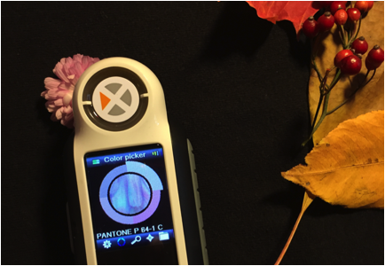
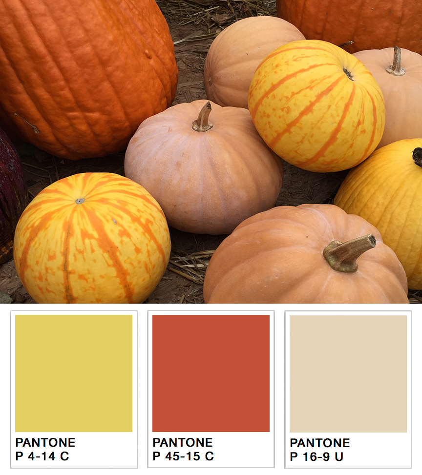
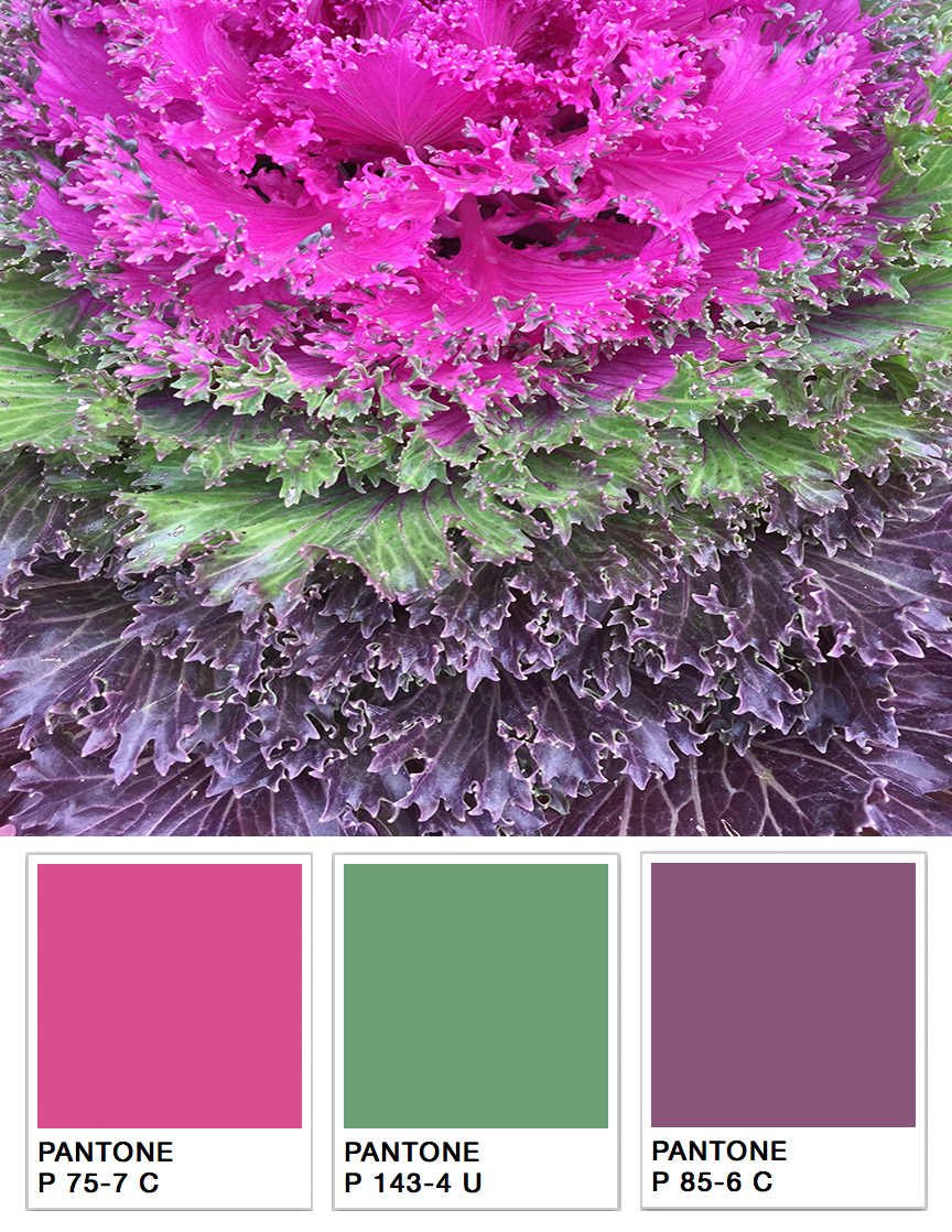
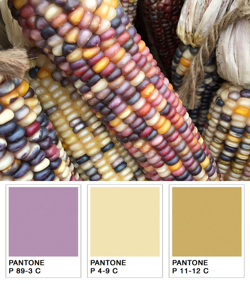
例をあげましょう。あなたは来秋の製品パレットを決めるタスクを任されて、ちょうどアディロンダック地方に1週間のハイキングに出かけるところだとします。山肌を覆う美しい紅葉や紫、赤、黄色など。そして、鮮やかなマム、パンプキン、ひょうたんが、あらゆる色合いのオレンジ色で小さな町を埋め尽くしています。これらの色をすべて覚えていて、スタジオで再現することができますか?
おそらく無理ではないでしょうか。
人間は200万色以上の色を識別することができますが、色の記憶は非常に乏しいです。「1分前に見た色を再現してください」と言われても、ほとんどの人が失敗してしまいます。
しかし、ポータブル分光測色計を持っていけば、その問題が起きません。さらに、スタジオに持ち帰れば、さまざまな色調を簡単に再現することができます。小型で高性能な分光測色計があれば、デザインナーはいつもどこでも便利に色のインスピレーションを得ることができます。
カラーマッチングツールの使用方法
エックスライトのCAPSURE デバイスで、インスピレーションからパレット仕様に移行するのに、以下の簡単な3つのステップをご紹介します。
- 校正されたCAPSUREを測定したい対象物に当て、ボタンを押します。CAPSUREは、あらゆる質感やパターンを測定することができます。
- CAPSUREはその色の数値を制作に記録し、あなたが選んだファンデッキ、どれでも最も近い色の一致を確認します。これを各オブジェクトに対して、繰り返す作業です。
- 撮影が終わったら、すべての美しい色を評価し、気に入った色を選び、Pantone仕様のデザインパレットを作成します。

ポータブル型の色識別・調色ツール
多用途
CAPSUREは、平面上の色を正確に読み取り、関連するカラーライブラリの中から最も近いものを見つけます。CAPSUREは軽量で、使いやすいです。デザインナーがコーディネートカラーを見つけるためサポートするデバイスだけでなく、ペンキ屋の店員まで最小限のトレーニングを受けるだけても、お客様が求めている壁、カーペット、家具、フローリング、衣類などの 色合わせの探し にも活用できます。
便利性
CAPSUREは、ハーモニーパレット、類似色、カラーナビゲーションの機能により、お客様の選択とデザインプロセスのために、推奨色を提供し、さらなるインスピレーションの求める場面に最適です。また、コーディネートカラーや補色パレットを開発するために、多色パターンの中の色を分離することができます。色情報を記録・保存してアクセントカラーの選定に利用したり、ダウンロードして店頭での調色に利用することもできます。
利用性
- 測定前にサンプルをプレビュー。ズームインして特定のエリアを手動で選択したり、詳細で多色なサンプルから主な色合いを自動的に特定することができます。
- USB充電池で駆動・軽量でどこにでも持ち運び可能です。
- 最大100の測定値を保存でき、内蔵マイクで各色の音声記録を作成できます。
- 独自のワンクリック・カラー識別システムにより、色成分を正確に識別し、カラーコレクション間のベストマッチを素早くクロスチェックできます。
- 保存した色を呼び出してカスタムパレットを作成し、一般的なデザインアプリケーションで選択を統合することができます。
Posted November 04, 2022 by X-Rite Color

なぜ分光測色計の校正が必要なのか? 分光測色計は現在、ほとんど100%デジタル化されています。実際、電球以外、アナログ部品はほとんどありません。デジタルは、アナログと比べ、安定性が高いものの、 許容誤差が非常に小さくなっています。このような厳しいスペックに収まるため、定期的に分光測色計の校正を行う必要があります。 電球の安定性 分光測色計と電球を使用し続けると、性質が変わり始めます。分光測色計の校正は、 このような電球の光生性能を補正するためです。慎重に校正を行うことで、電球の寿命が尽きるまで、何か月、あるいは、何年も安定した測定が可能になります。 タイルとレンズの清浄度 装置内には、色空間における2つの既知ポイント、すなわち定義された白と黒の設定があります。工場では、白のキャリブレーションタイルを定義するため、完全な反射率曲線が作られ、さらにブラックトラップ内の黒点を定義するため、完全な反射率曲線が作られました。白と黒の正確な位置は、キャリブレーションのため、デバイス内に設置されました。 白いタイルが少し汚れると、白い点が横軸の黒に向かって下がります。白点だけでなく、その線上にあ...
Posted November 03, 2022 by Mike Huda
.jpeg?h=285&la=ja-JP&w=400&hash=B68E8C442BE87DD22FD7684E788CE9480FCF698C)
色は大事だと、よく言われています。なぜ大事なのか知っていますか。実際、生産工程において、色はとても重要な要素です。しかし、残念ながら、多くのメーカーは、色を正しく表現することが以前と比べ、はるかに難しくなったと気づいています。なぜなら、取引先のブランドは、より厳しい許容範囲を満たすことを求めています。 その理由の一つは以下のとおりです。 メタリックパッケージ、真珠光沢仕上げ、カスタムファブリック、鮮やかな新色など、色技術の進捗は顧客を魅了する一方で、生産における一貫性を持たせることがより難しくなっています。 たとえば、コンポジットデッキを例としてあげましょう。以前はグレーかブラウンの2択しかありませんでした。そして、デッキ全体に調和が取れていけば、お客様は十分満足されました。しかし、今では、深い木目模様やエキゾチックな色など、多くの選択肢があります。そのため、メーカーは2~3色ではなく、数10色を管理しなければなりません。統一感を出すために、より難しくなりました。 パッケージもそのひとつです。かつて、印刷された箱のみが並んでいたお店でも、今はホイルパウチやブリスターパック、マルチ基...
Posted November 01, 2022 by Cindy Cooperman

When customers are just getting started with color management, they often ask, "What is the difference between a spectrometer and a spectrophotometer?". With such a minute spelling difference, it's easy to make a quick typo and get the wrong answer for this color question. So...what's the difference? Spectrometers vs. Spectrophotometers What is a Spectrophotometer? A spectrophotometer is a color measurement device that is used to capture and evaluate color on just about anything, in...
Posted September 13, 2022 by X-Rite Color

In this series we’ve been discussing the many factors that impact how we see color, and what we can do to ensure the color we see is accurate. Light, retinal fatigue and background effects can influence our perception of color. Today we’ll look at the limitations of the human eye and brain, and talk about how to detect these characteristics, especially for individuals responsible for evaluating and judging color. Are YOU color deficient? Read on to find out. (Spoiler alert: There’s a test at the...
Posted September 01, 2022 by X-Rite Color
