
Looking for a centralized location to manage your X-Rite products and services? Check out My X-Rite. Whether you need product information or support, service details, or access to learning resources, our free online portal is just a few clicks away. 24/7 Access: Easily access your personal dashboard from your computer or mobile device around the clock. Personalized Dashboard: See what matters most to you in one convenient location. Effortless Service & Support: Submit and track...
Posted April 25, 2024 by X-Rite Color

皆様の色の品質管理の工程には、目視評価が含まれていますか? もしそうでないなら、含めた方が良いでしょう。 標準光源装置SpectraLight QCを目視評価ワークフローの一部として使用 どの業種でも、色の評価は、測色計でサンプルを測色するだけではありません。測色計は色を許容範囲内だと表示していても、その結果は必ず人間の目に正しく見えるとは限りません。 顧客からの拒否を最小限に抑えるには、色管理プロセスに照明ブースでの視覚評価を含める必要があります。特に、同じ製品の異なるパーツを生産する場合です。なぜなら、工場内だけでなく、屋外や蛍光灯のある店舗など、世の中にどこで見られても、色の統一感が必要だからです。 本日は、皆様の品質管理の工程を、可能な限りレベルアップするために、目視評価するための10のヒントを紹介します。 目視評価に欠かせない標準光源装置を使用 エックスライト社製の標準光源装置SpectraLight QCは、さまざまな光源の下で色を評価・比較するための制御された環境を提供します。ここでは、標準光源装置の導入によって、色評価の工程を最大限に活用するための 10 のヒント...
Posted March 15, 2023 by X-Rite Color

Anyone responsible for printing goods or packaging knows that some colors, like orange, are just too difficult to reproduce using only CMY inks. A fourth color, black (K, which stands for key color) is often added to subtractive color printing applications. Since C+M+Y actually creates a muddy brownish color due to ink impurities in C, M and Y, adding a true black ink creates the deep color and tones that CMY alone can’t achieve, plus adds density to the shadows. This four-color printin...
Posted February 10, 2023 by Scott Harig

This time of year, the internet is full of Top 10 Countdowns. It’s a tradition we’ve embraced since 1940 when the Billboard published its first chart ranking the top selling recorded songs. Since then, others have jumped on the bandwagon to highlight the most popular trends of the previous year. We’ve been publishing our top-read blogs since 2016, and we’re happy to see some educational topics like color perception, tolerancing, and spectrophotometers continue to r...
Posted December 28, 2022 by X-Rite Color
.jpg?h=285&la=ja-JP&w=400&hash=2BB6CFDBCF85E21659AD201B3F207B65B1F89A45)
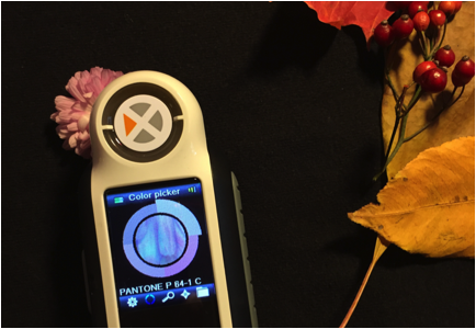
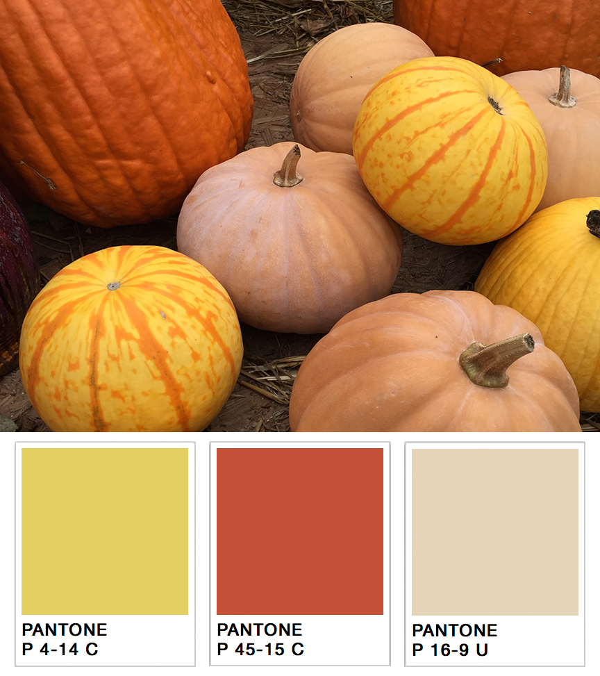
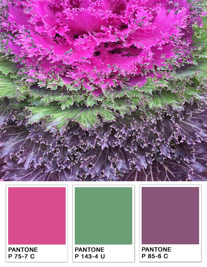
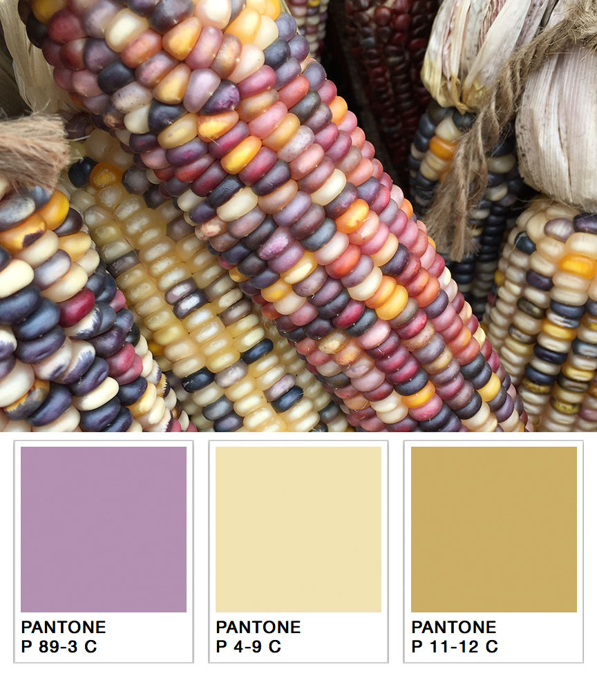
ブランドカラーの選定や、新製品ラインのパレット作成、季節のパッケージデザインなどのとき、色選びにはインスピレーションが不可欠なものとなります。
インスピレーションは日常の生活から得られます。
パーティー
食料品店
スポーツイベント など
そして、もちろん、自然です。母なる自然は、最も美しいカラーパレットを生み出すコツを知っています。
「2022/2023年秋冬の色彩は、安らぎと回復をもたらす色彩と、活力に満ちた色調を組み合わせることで、私たちが求める穏やかさや快適さと、エネルギーを高める活力を対比させています」と、Pantone Color InstituteでのエグゼクティブディレクターのLeatrice Eiseman氏は述べました。「矛盾に満ちた環境へ進む中、2022/2023年秋冬の色相は、消費者が対照的な色合いの間を流動的に移動することができ、その日の自分らしさや気持ちをのびのびと表現できるようにします」と述べています。
デザインナーはこうしたトレンドを意識して、消費者を惹きつける色合いの異なるパレットやコーディネートカラーを作成する必要があります。
例をあげましょう。あなたは来秋の製品パレットを決めるタスクを任されて、ちょうどアディロンダック地方に1週間のハイキングに出かけるところだとします。山肌を覆う美しい紅葉や紫、赤、黄色など。そして、鮮やかなマム、パンプキン、ひょうたんが、あらゆる色合いのオレンジ色で小さな町を埋め尽くしています。これらの色をすべて覚えていて、スタジオで再現することができますか?
おそらく無理ではないでしょうか。
人間は200万色以上の色を識別することができますが、色の記憶は非常に乏しいです。「1分前に見た色を再現してください」と言われても、ほとんどの人が失敗してしまいます。
しかし、ポータブル分光測色計を持っていけば、その問題が起きません。さらに、スタジオに持ち帰れば、さまざまな色調を簡単に再現することができます。小型で高性能な分光測色計があれば、デザインナーはいつもどこでも便利に色のインスピレーションを得ることができます。
カラーマッチングツールの使用方法
エックスライトのCAPSURE デバイスで、インスピレーションからパレット仕様に移行するのに、以下の簡単な3つのステップをご紹介します。
- 校正されたCAPSUREを測定したい対象物に当て、ボタンを押します。CAPSUREは、あらゆる質感やパターンを測定することができます。
- CAPSUREはその色の数値を制作に記録し、あなたが選んだファンデッキ、どれでも最も近い色の一致を確認します。これを各オブジェクトに対して、繰り返す作業です。
- 撮影が終わったら、すべての美しい色を評価し、気に入った色を選び、Pantone仕様のデザインパレットを作成します。

ポータブル型の色識別・調色ツール
多用途
CAPSUREは、平面上の色を正確に読み取り、関連するカラーライブラリの中から最も近いものを見つけます。CAPSUREは軽量で、使いやすいです。デザインナーがコーディネートカラーを見つけるためサポートするデバイスだけでなく、ペンキ屋の店員まで最小限のトレーニングを受けるだけても、お客様が求めている壁、カーペット、家具、フローリング、衣類などの 色合わせの探し にも活用できます。
便利性
CAPSUREは、ハーモニーパレット、類似色、カラーナビゲーションの機能により、お客様の選択とデザインプロセスのために、推奨色を提供し、さらなるインスピレーションの求める場面に最適です。また、コーディネートカラーや補色パレットを開発するために、多色パターンの中の色を分離することができます。色情報を記録・保存してアクセントカラーの選定に利用したり、ダウンロードして店頭での調色に利用することもできます。
利用性
- 測定前にサンプルをプレビュー。ズームインして特定のエリアを手動で選択したり、詳細で多色なサンプルから主な色合いを自動的に特定することができます。
- USB充電池で駆動・軽量でどこにでも持ち運び可能です。
- 最大100の測定値を保存でき、内蔵マイクで各色の音声記録を作成できます。
- 独自のワンクリック・カラー識別システムにより、色成分を正確に識別し、カラーコレクション間のベストマッチを素早くクロスチェックできます。
- 保存した色を呼び出してカスタムパレットを作成し、一般的なデザインアプリケーションで選択を統合することができます。
Posted November 04, 2022 by X-Rite Color

なぜ分光測色計の校正が必要なのか? 分光測色計は現在、ほとんど100%デジタル化されています。実際、電球以外、アナログ部品はほとんどありません。デジタルは、アナログと比べ、安定性が高いものの、 許容誤差が非常に小さくなっています。このような厳しいスペックに収まるため、定期的に分光測色計の校正を行う必要があります。 電球の安定性 分光測色計と電球を使用し続けると、性質が変わり始めます。分光測色計の校正は、 このような電球の光生性能を補正するためです。慎重に校正を行うことで、電球の寿命が尽きるまで、何か月、あるいは、何年も安定した測定が可能になります。 タイルとレンズの清浄度 装置内には、色空間における2つの既知ポイント、すなわち定義された白と黒の設定があります。工場では、白のキャリブレーションタイルを定義するため、完全な反射率曲線が作られ、さらにブラックトラップ内の黒点を定義するため、完全な反射率曲線が作られました。白と黒の正確な位置は、キャリブレーションのため、デバイス内に設置されました。 白いタイルが少し汚れると、白い点が横軸の黒に向かって下がります。白点だけでなく、その線上にあ...
Posted November 03, 2022 by Mike Huda

When customers are just getting started with color management, they often ask, "What is the difference between a spectrometer and a spectrophotometer?". With such a minute spelling difference, it's easy to make a quick typo and get the wrong answer for this color question. So...what's the difference? Spectrometers vs. Spectrophotometers What is a Spectrophotometer? A spectrophotometer is a color measurement device that is used to capture and evaluate color on just about anything, in...
Posted September 13, 2022 by X-Rite Color

How many trial and error steps does it take you to formulate a color? If you answered more than three, it might be time to enlist the help of a computerized solution. Computer-aided color formulation can bring huge benefits to your business. Out of the gate, even beginners can hit color targets faster, saving time, money and expensive colorants. Once you have established an accurate method, you can expect to match 95% of your color formula requirements within a reasonable color distance on the f...
Posted July 07, 2022 by Mike Huda

用途に適した eXact™ 2 モデルを選択するには?本日は印刷と包装印刷について、装置、ソフトウェア、サポート機能を分析していきます。 印刷業者&コンバーターをサポートする eXact 2 装置の強化機能 まずは、eXact 1 と eXact 2 の主な違いを見てみましょう。 30% 拡大したチルトディスプレイ + 2 倍の解像度:プレスシートを一日中測定する際、目や首に非常に負担がかかります。この新機種はそのような状況を把握し、優れたサポート機能を装備しました。印刷機から本体を持ち上げる必要がないため、落下や破損を防ぎます。アップデートされたインターフェース:eXact 2 の新しいユーザーインターフェースは、ほとんどの測定機能において「ワンタップまたはダブルタップだけ」の簡単操作となっています。クリックの回数が少なくなり、作業時間を短縮します。また、より直感的に使えるようになり、新しいオペレーターの教育研修もスピーディーに効率よく行えます。高解像度のカメラを搭載:高解像度カメラと Mantis™ ビデオターゲティング テクノロジーを搭載した...
Posted June 13, 2022 by X-Rite Color

As the range of substrates, inks, and printing technologies has expanded, so has the challenge of maintaining color quality for brands and printers. A workflow based on digital standards is the easiest way to achieve accuracy and consistency across shifts and sites, regardless of production requirements. Adding a quality control solution like ColorCert® to your workflow can boost your bottom line even more. What is ColorCert? ColorCert is a modular, job-based solution that streamlines color ...
Posted April 26, 2022 by X-Rite Color

With more consumer package goods (CPG) brands implementing packaging quality control programs to monitor color tolerances, converters and package printers need color measurement solutions that integrate directly with reporting systems. Our IntelliTrax2 Pro and eXact Auto-Scan Pro Scanning Solutions combine the power of our industry-leading automated scanning devices with the power of our end-to-end software solutions to meet the needs of brands, packaging converters, and commercial printers alik...
Posted April 06, 2022 by Christian Benz

When choosing a beverage product from the store shelf, consumers not only demand superb taste, but also consistency in the way the beverage looks to the human eye. Color and transparency are essential markers for quality - any imperfection can indicate contamination, impurities in the raw materials, or process variations caused by heating and oxidation. However, drinks like fruit and vegetable juice, beer, and blended cocktails are difficult for manufacturers to control during production. Natura...
Posted January 21, 2022 by X-Rite Color

.upcoming-webinar-block { width: 100%; display: table; margin-bottom: 20px; } .upcoming-webinar-left { width: 120px; padding-right: 20px; display: table-cell; } .upcoming-webinar-left img { margin-top: 10px; } .upcoming-webinar-right { vertical-align: top; display: table-cell; } Color measurement devices have been around since the 1940s, but they’ve come a long way since then. Built by Jules Duboscq in France in 1870, t...
Posted January 19, 2022 by X-Rite Color

In a perfect world, you should be able to put ink in the press and simply run a job. Unfortunately, every year flexo and gravure printing operations waste ink, substrate and press time trying to get color right. Although advancements in technology have made it easier to achieve color accuracy, the variables that affect color still exist. In this three-part series, we're sharing over two dozen reasons your color might be wrong on press. If you missed the first article - Instrumentation - check i...
Posted October 19, 2021 by Scott Harig

In a perfect world, you should be able to put ink in the press, run a job, and achieve color consistency. Unfortunately, every year flexographic and gravure printing operations waste ink, substrate, and press time trying to get color right. Although advancements in technology have made it easier to achieve color accuracy, the variables that affect color still exist. In this three part series we’ll share over two dozen reasons your color might be wrong at press side. Today’s topic lo...
Posted October 18, 2021 by Scott Harig

In a perfect world, you should be able to put ink in the press and simply run a job. Unfortunately, every year flexo and gravure printing operations waste ink, substrate and press time trying to get color right. Although advancements in technology have made it easier to achieve color accuracy, the variables that affect color still exist. In this three-part series, we’re sharing over two dozen reasons your color might be wrong on press. We’ve already covered two important factors &nda...
Posted October 18, 2021 by Scott Harig

測色は、色の重要な作業において、色の品質を指定・定量化・伝達・定形化・検証するために必要です。色の感じ方は人それぞれ異なるため、測色は目視評価より正確な結果を得られます。 色測定とは? 色測定は、サンプルによって放射・透過・反射される光の量をとらえ、スペクトルデータとして定量化することで、光源の変化分も捉えることが出来ます。測色計(分光測色計)で行う色測定は、目視評価より正確です。なぜなら、人間の色認識は差を表すのは得意ですが、定量的に示すことは不得意です。色に関わる重要な作業には、色を識別・定量化・伝達・区別するための分光測色計の導入を強く推奨します。 色波長の測定方法 色を測定するには、分光測色計と呼ばれる測色装置でサンプルに光を当て、人間の目に見える波長範囲である380nmから780nmの範囲で透過または反射した光の量をとらえます。分光測色計は波長範囲にわたるスペクトル波長測定に基づき、計算を行い、スペクトルデータを定量化します。 測色計とは? 測色計には、色彩計と分光測色計の2種類あります。 色彩計は人間の目と同じように色を認識し、赤・緑・青を感じる3...
Posted August 24, 2021 by X-Rite Color

Learn about light, reflection curves, optical brighteners, and more. Illuminants Electro magnetic radiation in the wavelength range from 380 nm to 730 nm is seen as light by our eyes. Low wavelengths show as blue light, then the spectrum continues from green to yellow, orange, and red. UV radiation is located in the range below 380 nm; the range above 730 nm is called infrared radiation. The visual impression of a colored body changes by the composition of the incoming light. ...
Posted July 22, 2021 by X-Rite Color

ICCカラーマネジメントとは、撮影からプルーフィング、最終出力まで、予測でき、一貫性があるワークフローを実現することです。 カラーマネジメントのワークフローを実現するために、デバイスのキャリブレーションを行い、カメラやモニター、プロジェクター、スキャナー、プリンターなど、すべてのコンポーネントに対して、ICCプロファイルを作成する必要があります。 なぜキャリブレーションとプロファイルが必要なのか? 最高の結果を得るためには、ワークフローにおける各デバイスのキャリブレーションを行い、正確にカラーを実現できるようにする必要があります。 次に、同じカラーの認識が一致するため、ICCプロファイルを作成する必要があります。なぜかというと、同じ色でも、再現フォーミュラーがそれぞれのデバイスで大きく異なるからです。 カメラとモニターは同じRGBでも、色再現の手段が異なります。CMYKを使用するプリンターとプレス(印刷機)も同様です。ICCプロファイリングは、両者に共通認識を与え、カラーデータを共有できるようにするものです。 ICCプロファイル作成方法一覧 エックスラ...
Posted January 27, 2021 by Ray Cheydleur

COVID-19 has forced many companies to rethink the way they communicate, approve, and produce color. For some, that means trying to conduct “business as usual” from a remote location. For others, it means finding ways to manage color without travel. Either way, we know our customers are doing everything they can to sustain business while keeping their employees healthy and safe. We want to help. Over the past few months we’ve been adding new resources to our virtual resou...
Posted December 15, 2020 by X-Rite Color

The Pantone Color of the Year announcement is always exciting. Not only does it set the stage for upcoming trends, it also provides brand owners and designers critical guidance for marketing and product development. However, those who are charged with manufacturing products and packaging with trending colors (like 2021's Ultimate Gray and Illuminating) know it doesn’t “just happen.” It takes time and effort to incorporate new colors. Whether you work in paints, plasti...
Posted December 14, 2020 by X-Rite Color

As we always say, with so many places for color to go wrong it can be hard to know how to get it right. This is especially true if you’re measuring or viewing color with a device that is out of calibration or needs service. You can spend a lot of time trying to locate a color problem that may not exist – or even worse, create a new one. One simple way to minimize color errors and inconsistencies is to calibrate, maintain, and certify your devices. At X-Rite, our goal is to make this ...
Posted November 30, 2020 by Mike Soriano

The color of liquid is one of the most difficult things to control during production. But it’s important. Would you choose a bottle of juice or cleaner that is lighter in color than the other bottles on the shelf? What about cough syrup? Liquid is hard to measure because it can range in transparency from translucent to opaque. It’s also hard to hold, and the measurement device can’t touch it or the optics and the sample will both be contaminated. Today&rsq...
Posted October 27, 2020 by Tim Mouw

How much time, paper, and ink do you waste re-printing images because the color isn’t right? Before you blame your printer, consider your monitor. When you work on an un-calibrated and un-profiled monitor, you can’t trust the colors you see on-screen, making it hard to make good editing decisions. Luckily, monitor calibration and profiling is a breeze with i1Profiler software. i1Profiler comes with i1Basic Pro 3 and i1Basic Pro 3 Plus. Wizard-based, it walks you through every st...
Posted August 20, 2020 by Mark Gundlach

Softproofing – the ability to simulate how an image will appear in print right from your monitor – can save a lot of time and effort in your printing workflow. Although many photographers already rely on it, anyone who designs, approves, prepares or prints brand and color-critical images can also benefit. With softproofing, designers can create with actual specified colors (no more trial and error!), project owners can approve layouts without physical proofs (predictable color!), and...
Posted August 20, 2020 by Mark Gundlach

ブランドオーナーがパッケージを目立たせるために競争する中、商業用と軟包装のコンバーターやラベルプリンターはより短い期間で、独自の基材上で正確にブランドカラーを実現できることが求められています 。 多くの場合は、インクの調合に多くの時間を増やしますが、色が合わないと、結局捨ててしまいます。また、調合済みのインクを保存しますが、再利用できるように時間をかけすぎるケースも少なくありません。 このような無駄なリサイクルに陥っていると、インキの購入時とインキの廃棄時に、2回インキ代を支払っていることになります。この無駄の経済性はどうなっているのでしょうか。 私たちの地球への影響について、考えましょう。 本日は、InkFormulation Software(インキ調合ソフトウェア IFS6)の残材管理機能が、在庫や廃棄物の削減、廃棄コストの低減、さらに、より持続可能な印刷環境を実現することを説明します。 インクの調合は手作業で行っていますか。 この場合はターゲットカラーまで、約12回の試行錯誤を行わないといけないことをご...
Posted August 13, 2020 by Rich Knapp

Whether you’re producing textiles, automotive parts, or plastic pieces, color needs to remain consistent or the final product will be rejected. Unfortunately, there are many ways for color errors to creep in during manufacturing. Creating and using accurate digital color standards is one way to combat these errors. Digital color standards can be used in software to specify and communicate color, formulate colorants and raw materials, and control color quality. They give brand owners peac...
Posted August 03, 2020 by Tim Mouw

COVID-19 has stopped many industries in their tracks, textiles included. Travel bans and shelter-in-place orders are forcing vast, inter-connected supply chains to rethink the way they work. For brands that were already looking for new ways to achieve accurate color and speed time to market, this could be an opportunity. This global pandemic may help the apparel industry make important decisions to change the way it works – for the better – not only to get through this crisis, ...
Posted May 19, 2020 by Bob Karpowicz

Our customers who are now working remotely need to be aware that changing a small variable – such as approving color from home under a different light source, or emailing specifications instead of sending a physical sample – can introduce color issues that risk creating a larger color problem. The first and most critical stage to color control is accurate color communication. These resources will help you get started. The Importance of Color Communication Blog | Many color...
Posted March 27, 2020 by X-Rite Color

Spectrophotometers (“spectros” for short) are color measurement devices used to capture and evaluate color. As part of a color control program, brand owners and designers use them to specify and communicate color, and manufacturers use them to monitor color accuracy throughout production. Spectrophotometers can measure just about anything, including liquids, plastics, paper, metal and fabrics, and help ensure that color remains consistent from conception to delivery. &nb...
Posted March 27, 2020 by X-Rite Color

Phone and computer screens are the window into the digital world of color, but if you are approving colors via email or text you need to be aware of the limitations. For starters, each of your devices relies on a different color model to display color. Input devices – your camera and monitor – use the additive color model to display color. They start with darkness and add red, green, and blue light to create a spectrum of colors. Printers, on the other hand, use the s...
Posted March 27, 2020 by X-Rite Color

Does your quality control program include visual evaluation? Lighting plays a huge role in how we perceive color. It can help you verify whether the color of your product is acceptable and ensure it remains accurate in every possible lighting condition after purchase. Many of our customers are finding visual evaluation to be even more important as they transition color reviews and approvals to a different location, such as in the home office or to another remote environmen...
Posted March 27, 2020 by X-Rite Color

So much goes into the way you perceive color, including light, genetics, the environment, human traits, and even fatigue. You may also be among the 1 in 255 women and 1 in 12 men who have some form of color vision deficiency. Our online color challenge is a fun way to better understand your color vision acuity. Regardless of your color vision acuity, if you are communicating, evaluating, or approving color from a new location your eyes may trick you into making diff...
Posted March 27, 2020 by X-Rite Color

Color has always been a critical factor for our customers. Due to the COVID-19 pandemic, many are now trying to design, specify, communicate and ultimately achieve accurate color from remote locations or with less staff and fewer resources. Are you having trouble maintaining your color program in this unprecedented time? We've compiled our most popular resources – blogs, videos, whitepapers, webinars, and case studies – to help you connect with your supply chain and ...
Posted March 27, 2020 by X-Rite Color

As with everything we touch, our color measurement instruments are prone to contamination from germs and viruses. Our Hardware Team consulted CDC advice and put together steps to disinfect your benchtop and handheld devices. Disinfection Warnings Do not immerse your device in liquid or apply any type of liquid directly on the instrument. Refrain from spraying disinfecting product directly onto the instrument surface, including foam disinfectants. Do not use product...
Posted March 25, 2020 by X-Rite Color

In my recent blog I explained why the demand for printed fabrics is increasing and the challenge this poses for the digital print industry. Today, with help from Digital Imaging Expert Scott Martin of Onsight, I will share tips and tools to help printers profile textiles for a consistent digital workflow. While smooth textures can often be measured using traditional digital tools, fabrics with texture or specular reflections (like coated canvases) can cause issues. It's a lot harder to achieve ...
Posted January 28, 2020 by Ray Cheydleur

Durable goods and consumer electronics are no longer destined to be white, gray, and black. In fact, consumers are moving towards more classic colors and special effect finishes like metallics. To capitalize on this trend, brands need to bring innovative designs in new colors faster to market than ever before. One trending color, the PANTONE Color of the Year 2020, is sure to capture the attention of durable good and consumer electronic brands. It is a simple, timeless, elegant, and endur...
Posted December 09, 2019 by X-Rite Color

The eXact is a handheld spectrophotometer with an intuitive touchscreen interface. Printers and packaging converters use it to control, manage, and communicate color from anywhere on the pressroom floor. It comes in a variety of models to fit every customer need, and can be upgraded as those needs change. With so many to choose from, it can be hard to know which eXact model is right for you. Today’s blog can help you decide. Explore by eXact Model eXact Basic Densitometer: If...
Posted November 07, 2019 by Keal Harter

Inter-instrument agreement is a very important consideration when selecting color measurement devices for your workflow. Unfortunately, it’s such a technical topic that it leads to a lot of confusion about what it means and why it’s important. The Ci7860 sphere benchtop spectrophotomter is has an inter-instrument agreement specification of 0.06 average Delta E*, enabling brands to create the most precise master color standards. Today we’re making it as simple as possibl...
Posted October 03, 2019 by Mike Huda

Spectrophotometers are color measurement devices that measure color to ensure it remains consistent from the time it’s specified until final quality check. They can be used to measure everything from liquids and plastics to paper, metal, and fabrics for just about every industry. Here Are Our Top Spectrophotometer Picks for 2019. Best Spectrophotometer to Create Digital Standards Using a digital standard is the most accurate way to specify and communicate color, des...
Posted August 16, 2019 by X-Rite Color

Each color has its own appearance based on three key attributes – hue, chroma (saturation), and value (lightness). When you’re describing a color, it’s important to use all three of these attributes to accurately identify the color and distinguish it from others. What is hue? Hue is defined as how most of us perceive and name a color – using the colors of the rainbow (red, orange, green, blue, etc.). Reference the color wheel, below, to see how colors shift from one...
Posted August 15, 2019 by X-Rite Color

Controlling color on cylindrical-shaped items like cups, cans, and tubes is a challenge because it’s hard to properly align the measurement device with the sample. Many printers and manufacturers cut a piece from the finished product and lay it flat to take a measurement. While this method works, each sample takes time to cut, wastes product, and risks the safety of the employees who are cutting the samples. A Faster, Safer Solution X-Rite’s Cup and Cylinder Fixture works ...
Posted July 17, 2019 by Bob Binder
With so many requests for innovative bases, transparency, and special effects, formulating color for paint, coating, and plastic applications can be a challenge. To keep up, formulation software needs to be innovative, too. We recently launched version 10 of our Color iMatch formulation software, and it is our smartest version yet. It allows you to select cost-reducing parameters, such as lowest cost or fewest colorants, and will determine the best formula for your application. It work...
Posted July 10, 2019 by Rich Knapp

Hitting offset lithographic color targets isn’t always fast or easy. The manual process of measuring color bars and making ink key adjustments takes time and opens the door to operator error. Meanwhile, the press is running (and wasting) paper and ink. To achieve accurate and repeatable color, printers need to convert their printing operation to an efficient manufacturing process and drive efficiencies in all phases of their operation. For many, a closed-loop automated solution is the...
Posted April 03, 2019 by Ray Cheydleur

ベンチトップ分光測色計は、ガラス、液体、繊維など、さまざまな不透明、透明のサンプルの色を透過または反射モードで測定・定量化することができます。本記事では、透過測定と反射測定の違いを説明し、どのベンチトップ分光測色計を選ぶと良いか、ご説明します。 透過測定と反射測定 透過測定と反射測定が可能な分光測色計は、フラッシュを照射し、透過または反射された光を測定し、360~750nmの間のすべての光の波長の分光透過率または分光反射率を作成します。反射して戻ってくる主波長がその色を示します。青紫、藍、そして青は、波長が短く、400~550nm。緑はその中間で、550~600nm。黄、オレンジ、赤は最も長い波長を示します。OBAと蛍光剤含む場合は、100%以上のピークに達します。 反射測定の分光測色計は、サンプルの表面に光を照射し、10ナノメートル単位で反射率を測定することで色を測定します。完全に不透明な表面を測定する場合、反射測定の分光測色計で十分です。 一方、透過測定の分光測色計は、サンプルを通して光を投影できます。反対側にある検出器は、透過した光の波長と量をとらえ、平均透過率も数値化できま...
Posted February 26, 2019 by Mike Huda

For the last few Decembers, we’ve provided you with a list of “top color measurement blogs” for that respective year. As we reviewed this year’s list, we noticed that your favorite/ the most-read blogs could be categorized into a few buckets. So, without further ado, here’s 2018’s top blog topics! 2018’s Most Popular Color Measurement Topic: Tolerancing Not to our team’s surprise, Tolerancing – what it is/what it means for your busines...
Posted December 20, 2018 by X-Rite Color

Each year, Pantone announces its highly anticipated “Color of the Year”. The selection is intended to serve as a strategic direction for design and color-conscious industries as well as a conversation piece around our culture, where it is going and what we collectively need…and it certainly gets everyone talking about color! Color is no longer just something we see and appreciate - it enhances and influences the way we experience life. Color, as a strategic element of d...
Posted December 06, 2018 by Tim Mouw

Like geographic coordinates – longitude, latitude, and altitude – L*a*b* color values give us a way to locate and communicate colors. What’s the history of L*a*b*? In the 1940’s, Richard Hunter introduced a tri-stimulus model, Lab, which is scaled to achieve near uniform spacing of perceived color differences. While Hunter’s Lab was adopted as the de facto model for plotting absolute color coordinates and differences between colors, it was never formally accepted as...
Posted October 08, 2018 by Tim Mouw

Closed-loop color can mean something different to different audiences. When I first think about closed-loop color control, I may think about the pressroom, where it is really just a question of integrating measurements directly from the press, adjusting them, measuring and reporting, offering a nice closed-loop system that adjusts, controls, and allows me to report the results. But that’s really only one small aspect. You can incorporate a loop from the ink room, for instance, and bring t...
Posted April 02, 2018 by Ray Cheydleur

The two most common spectrophotometers are the 0:45 and the sphere (aka diffuse/8°). We get a lot of questions about which is the best choice. Here’s the difference in how these two devices measure color, and guidelines for when to use each. 0:45 In a “fixed geometry” or “single angle” device, the first number is the starting point of the light, and the second number is where the light ends up after the reflection off the surface of the sample. In a 0:45 ...
Posted January 18, 2018 by Mike Huda

Using a light booth to visually judge color is a great start to a successful color evaluation program. It allows you predict how color will look under multiple light sources so there won’t be any color surprises when the light changes over the life of the product. Introducing a color measurement device to capture spectral data is the next logical step. For a really great color program, you need to use both a light booth AND a spectrophotometer. This dynamic duo offers benefits you can&rsqu...
Posted December 18, 2017 by Mike Huda

If you work behind a paint counter, you know customers can surprise you with interesting and unique objects to color match. Many samples are relatively easy to measure, but when a customer shows up with a curved baseboard panel, a square of shag carpet, or a plush toy, things can get a little tricky. A few years ago, we learned just how challenging it was for our retail paint customers to color match unique samples. We took in a bag with textured and multi-colored items and asked the person behi...
Posted December 04, 2017 by Tim O'Rourke

新車、消費者向けエレクトロニクスや電化製品を購入する際、製品色は品質にも影響する重要な要素です。例えば、製品の前と後ろの色が違っていれば、品質自体も疑われることでしょう。そのような心配は、正確な測色により解決します。 今日の競合市場において、メーカーは常にスキルアップを目指し、特殊効果のある仕上げを用いて製品の差別化を行っています。一方、特殊効果のある仕上げを特徴付けたり、隣接するパーツ部品と一貫性を保つためには、測色だけでは不十分であることが認識されています。 自動車産業では新車の約70%がパール系、シラリックなどのエフェクト顔料を特殊効果の仕上げに採用しています。これらのマテリアルの特性を正確に把握するためには、単なる測色だけでは不十分です。バンパーや車体パネルなど、隣接するパーツとの一貫性も確保することが必要となります。 色彩、粒子輝度感、粒子感を特徴付ける新しい MA-T 多角度分光測色計シリーズは、特殊効果のある仕様をグローバルで設定、共有、確保します。 MA-T へのアップグレード MA-T シリーズの多角度分光測色計は、特殊効果のある色材管理の指標設定を行...
Posted October 25, 2017 by Thomas Meeker

If you’re reluctant to buy clothing and home decorating products online or in the store because you’re not sure how the color will look when you get home, you’ll love X-Rite’s newest color-matching solution. Color-Eye® uses a calibration card and smartphone app to help consumers shop for items that match or complement things they already have at home, like a paint color that looks great with the curtains, a handbag and shoes that coordinate with a special occasion dress, or a jacket that will ma...
Posted August 15, 2017 by Matthew Adby

If you recently invested in a spectrophotometer or colorimeter, you know there’s a lot more to learn about color measurement than just how to use your new device. To help you begin exploring the exciting world of color, we’ve compiled seven blogs that explain how to set up your color measurement device, care for it, and use it to its maximum potential. 5 Tips for Setting Up Your Spectrophotometer Using a spectrophotometer (“spectro” for short) to measure color doesn...
Posted July 25, 2017 by Mike Huda

Did you read our blog: Are You Using The Right Tolerancing Method? If not, check it out. Today we’re taking the topic one step further to investigate how tolerances are chosen in different industries. A pass-fail tolerance is the amount of color variation that is considered commercially acceptable. In part, tolerances are driven by customer expectations. While color tolerances are very tight in the automotive, plastics, and paint & coatings worlds, they can be much less strict in other...
Posted May 02, 2017 by Mike Huda

Consistent color is a journey. A few weeks ago I blogged about the most common pitfalls people run into when starting a color program… Wrong lighting Less-than-perfect color vision Inaccurate physical standards Inconsistent device color measurement …And introduced some inexpensive color tools to help overcome them. But the journey doesn’t stop there. Even if you’ve been successfully managing color for years, advances in inks, dyes, and substrates are introducing new challen...
Posted March 13, 2017 by Shoshana Burgett

At X-Rite Pantone, we love color, and we’re passionate about helping you get yours right. That’s why we offer a full-service training program, staffed with Color Experts from many of the industries we serve. From beginner to advanced, lowest investment to highest return, we offer a variety of options to teach you everything you need to know to be successful. Are you new to color, wondering where it fits in your business objectives? Do you already have a color workflow, but ...
Posted February 09, 2017 by X-Rite Color

When judging color, background can be a major distraction for the human eye. In fact, surrounding colors and patterns can actually change the perception of the color you’re trying to focus on. One of the wonderful things about color measurement instruments like colorimeters and spectrophotometers is that they can’t be distracted. They aren’t susceptible to variables such as fatigue, age or color vision deficiency. They aren’t even aware that a surround exists – they...
Posted December 01, 2016 by Mike Huda

If you’re a commercial printer who wants to improve color quality and consistency, this blog is for you. X-Rite color management solutions for print and packaging deliver excellence in quality control, formulation and automation. Ray Cheydleur is a printing industry veteran of more than 20 years, a standards guru, and our Portfolio Manager for Printing and Imaging Products. Passionate and very knowledgeable about color, he has a talent for helping printers improve their color quality and c...
Posted November 10, 2016 by X-Rite Color

In color production, mistakes can happen anytime, anywhere… during specification, formulation, manufacturing, assembly, quality control, or (unfortunately) all of the above. Every mistake adds up to wasted time and materials, and stacking errors across a production workflow can get expensive very quickly. How can you stop this error stack from happening? If your job requires you to get color right, spectral data should be your best friend. One of our favorite eLearning courses to help customers...
Posted October 06, 2016 by Mark Gundlach

Each year Printing News asks their readers which new products made the most difference in their productivity. We’re excited to announce that our very own i1iSis 2 and i1iSis 2 XL are among the winners! These two automated chart readers are the latest members of the popular i1iSis solutions family for pre-press, pre-media, photo, and pressroom color management and profiling. In high production environments such as photo processing, large format, fine art and high-speed digital printing, frequen...
Posted September 16, 2016 by X-Rite Color

For many of us, fun in the sun can lead to a summertime tan. The science behind this sun + skin interaction is melanin, a skin pigment our body releases to block the UV rays found in sunlight. The more time we spend in the sun, the more melanin is released, and the darker (or more freckled) our skin becomes. This shift in skin tone doesn’t matter for most people, but for prosthetic wearers even a slight change can be a big deal. Here’s how Royal Preston hospital in the United Kingdom is using co...
Posted June 24, 2016 by Matthew Adby

If so, we’d like you to know there’s an easier way. An upgrade from the original IntelliTrax, IntelliTrax2 is an automated, non-contact scanning system that makes it easy for busy pressrooms to measure color bars and press sheets without the risk of human error. Adding press-side quality control into your color workflow can shorten your makeready, reduce waste, and help you get to optimum color quality fast. IntelliTrax2 is an ideal color management solution for high-end, high-speed commercial ...
Posted June 21, 2016 by Scott Harig

When visually evaluating color, everyone accepts or rejects color matches based on their color perception skills. In manufacturing, this subjectivity can lead to confusion and frustration between customers, suppliers, vendors, production, and management. Are these acceptable color differences? This is why color measurement devices are important in so many industries. By measuring colors using a spectrophotometer, you can communicate and compare spectral data for exact results. To aid in color...
Posted June 15, 2016 by Tim Mouw

In an effort to reduce costs and keep up with demand, many U.S. textile and apparel companies are turning to global markets for their raw materials. According to a recent study by The University of North Carolina at Greensboro, this trend has been spurred by trade agreements, and it’s putting a lot of pressure on manufacturers to find suppliers with high quality raw materials at low prices. Since final products are only as consistent as their raw materials, working with a v...
Posted June 08, 2016 by Mike Huda

We’ve all done it. Snapped a picture on a digital camera or smart phone, sent it to the computer, made a few adjustments, then sent it off to print…. only to be disappointed. The sky looks green. Grandma’s hair is purple. The contrast is so far off you can’t even see that cute little puppy. Stupid camera. The struggle is real for so many people, from hobbyist to professional photographers, graphic designers, and professional printers. Let’s look into this all-too-common mystery of the off-color ...
Posted May 18, 2016 by Bruce Wright

Real or fake? When it comes to medicating children, consumers need to know the products they choose are genuine. When you hear the word counterfeiting, do you automatically think of counterfeit money? Unfortunately counterfeiting goes much farther than that. It’s impacting just about every industry worldwide. It is a huge problem for product integrity and results in financial loss. Estimates put counterfeited and pirated goods at some 2 to 2.5% of world trade, with a value of $600 billion or mor...
Posted May 11, 2016 by X-Rite Color

You’re at the grocery store, trying to choose a new snack. With so many brands on the shelf, how will you decide? If you’re like most consumers, you’ll probably reach for the most attractive package. Color and packaging play a leading role in brand success, and metallized substrates are more popular than ever. Consumers love them because they convey quality and offer additional strength and protection, but for printers, metallized substrates are expensive and make print color ...
Posted May 05, 2016 by Mark Gundlach

No matter what you’re manufacturing, taking spectral measurements will help ensure your color remains accurate and consistent throughout your production run. When choosing the best spectro for your needs, your first consideration should be the type of surface you’ll be measuring. Measuring reflective surfaces poses a challenge because the effect of gloss can actually change the color appearance of a sample. The surface reflection of light is what causes the gloss effec...
Posted April 27, 2016 by Tim Mouw

Physical standards are one of the most precise ways to communicate color in many industries, including textiles, print, automotive, paints, food, chemicals, packaging, and plastics. Many brand owners and designers communicate color expectations using physical standards, and suppliers and manufacturers rely on them to capture spectral data for formulation. While physical standards can be a great help, they can also hurt business if they’re not cared for properly. Today we’ll look at five tips to...
Posted April 20, 2016 by Mike Huda

Sharing a strong passion for how color can transform a face, mood or even an attitude, Pantone® has once again partnered with Sephora, the leading beauty specialty retailer, to create another extraordinary PANTONE Color of the Year cosmetic collection. Launched on December 26th, the SEPHORA + PANTONE UNIVERSE collection includes a 24-color eyes palette, a matte lipstick in each color, and a 5-piece lip gloss set. The first SEPHORA + PANTONE UNIVERSE collection was released in 2011 with Tangerine...
Posted March 28, 2016 by X-Rite Color

In the world of retail paint, getting to the best color match quickly is key to keeping your customers happy and coming back for more. Today we’ll review ways to get the most from your color measurement tools and how to match paint so your associates can be color experts, and you can enjoy fewer corrections and improved profitability. Do any of these swatches match the customer’s quilt? Not really. Gain customer’s trust by creating a perfectly matched paint color. Color...
Posted March 21, 2016 by Tim Mouw

Green is green, right? Maybe if you’re celebrating St. Patrick’s Day, but not when your bottom line is impacted by color accuracy. In the color industry, a tolerance is the acceptable amount of difference between a standard (the color you’re trying to match) and a sample (the color you are producing). To determine whether a color is within tolerance, many manufacturers use a color measurement device called a spectrophotometer to measure both colors and compare the difference be...
Posted March 16, 2016 by Mike Huda

If you work in an industry where color accuracy is important, you know that lighting plays a huge role in how you perceive color. A light booth is a crucial part of any visual evaluation program. It can help you verify whether the color of your product is acceptable, plus ensure it will remain accurate in every lighting condition after purchase. When parts are manufactured at different factories, a light booth should also be used to make sure they continue to match under any lighting condition o...
Posted March 11, 2016 by Tim Mouw

Extended gamut printing is becoming more and more popular in the printing industry. With Pantone’s new EXTENDED GAMUT Guide, printers and designers have a visual guide to help predict how close of a match is possible when they use 7-color process in place of spot inks. Ron Voigt, President of X-Rite Pantone, was recently interviewed on the topic by Cary Sherburne, senior editor at WhatTheyThink. According to Voigt, the EXTENDED GAMUT Guide helps printers visualize how well Pantone...
Posted February 15, 2016 by X-Rite Color

In a perfect world, you should be able to put ink in the press and run a job. Unfortunately, there are so many variables that affect color that printing operations often waste thousands of pounds of substrate, and thousands of dollars in press time, making adjustments. Advancements in technology have made it easier to measure color, but the variables still exist. To help you over come them, we’ll be featuring a series that points out many of the reasons your color could go wrong at press side....
Posted February 01, 2016 by Scott Harig

X-Rite’s inline color measurement solutions monitor color accuracy during production. If color begins to move out-of-spec, the system alerts operators to make corrections before any product is wasted. Coil coating is one area where inline color measurement is very effective for achieving the most cost benefit. The coil coating process has been around for more than 30 years, allowing companies to produce durable and attractive products. However, to achieve cost benefit, the focus must be o...
Posted January 19, 2016 by Greg Stehn

Color is a critical factor when selecting cosmetics and skin tone products. Women everywhere venture into stores, compare sample after sample trying to find the closest match, and hope for the best. With hundreds of different options, product lines and color palettes, buying makeup can be an expensive and frustrating process. Color technology to the rescue. Today we’ll look at how the CAPSURE Cosmetic spectrocolorimeter and the CAPSUREme mobile app are revolutionizing the way women buy makeup. ...
Posted December 15, 2015 by Matthew Adby

Using a spectrophotometer to measure color doesn’t necessarily mean you’re going to capture accurate data. The most common reason for incorrect measurements and inconsistent readings among instruments is using the wrong device settings. Today we’ll look at five things you must consider when setting up your device and taking measurements. Illuminant and Observer angle The illuminant describes the color of the light under which you’re judging colors. To accurately determine how the color will...
Posted December 03, 2015 by Scott Harig

If you use eXact with BestMatch™, the answer might be yes. BestMatch helps you determine if you can achieve a closer match to a specified color by adjusting ink on press. Formulating ink for a press run can be tricky because there are many things that go into it. The vehicle, colorants, and solvents are just a few of the things that impact ink quality, and whether it comes from your ink supplier or you mix it yourself, ink can vary in thickness or concentration. With BestMatch, you can confirm t...
Posted November 03, 2015 by Scott Harig

FLEXO Magazine just published a study conducted by Clemson University, Sun Chemical, and X-Rite that verifies that PantoneLIVE Dependent Standard Targets can be achieved with 98% accuracy. This is big news for the many brand owners, designers, prepress professionals, printers and converters around the world who rely on PantoneLIVE to communicate and accurately produce their color. The focus of PantoneLIVE is to protect brand colors and ensure production consistency across everything from flexibl...
Posted August 31, 2015 by X-Rite Color

The X-Rite eXactTM is a portable spectrophotometer designed for pressroom use. Two big reasons for its success are it’s cordless operation and innovative color touch screen, which it make it very easy for printers and packaging converters to understand, control, manage, and communicate color from anywhere on the pressroom floor. Today we’ll take a look at the top five features that make the eXact an invaluable tool for offset litho, flexo, and digital printers. Wireless operation, plus unteth...
Posted August 24, 2015 by Scott Harig

Would you choose a beverage off the store shelf if the same brand sitting next to it was a different color? The Bacardi Bottling Corporation knows the answer is probably no, which is why the company incorporates strict color standards into its Bacardi Mojito production process. Bacardi Mojito is a mix of premium rum, flavorings and special natural ingredients. Since the color of these ingredients can vary, Bacardi bottlers need to continually adjust their recipe to maintain consistent flavor an...
Posted August 10, 2015 by Mike Huda

Each year the Printing Industries of America selects the most innovative graphics arts solutions to receive the 2015 InterTech™ Technology Awards. This year, the X-Rite eXactTM spectrophotometer with Scan Option was among the recipients of this prestigious award. Today we’ll take a look at the top features that make the eXact with Scan Option a star with offset litho, flexo, and digital printers. X-Rite eXact is the only device that measures for optical brighteners for both inks and substrate...
Posted July 27, 2015 by Tim Mouw

To achieve predictable, repeatable color on a flexographic press, you need good color management and solid process control. Otherwise, hitting your colors is really just luck. Although it may take a little effort to set up, it’s worth it. Your customers will be more satisfied, and you’ll save time and money through faster make-ready time and fewer reprints. Today we’ll take a look at what’s involved in setting up flexo process control. The X-Rite eXact takes the guesswor...
Posted July 14, 2015 by Scott Harig

As we’ve talked about in previous posts, proper lighting conditions are crucial for evaluating color. The best way to know you’re seeing color accurately is to evaluate your samples in a quality light booth. But what if you don’t have a light booth available? Pantone has solved this problem with its LIGHTING INDICATOR Stickers. They’re economical, easy to use, and the second best way to find out if your viewing conditions are right for color evaluation. Here’...
Posted July 06, 2015 by Shoshana Burgett

Whether you’re printing on press or replicating a brand’s colors on the web, PANTONE’s Color Systems are the gold standard for communicating color specification and quality control. They provide a common language for color so specifiers and manufacturers can be sure they understand the customer’s expectations and reproduce those colors, even if they’re a world away. The PANTONE PLUS SERIES COLOR BRIDGE Set provides process color simulations of all solid PANTONE Colors as a side-by-side compariso...
Posted June 22, 2015 by Shoshana Burgett

Density only tells us one thing about a color – how light or dark it is. To compare and communicate accurate color in print and packaging, you also need to measure hue and saturation. Today we’ll take a look at the two most commonly used color models: CIELAB and L*C*h°, and the tolerancing methods that help us describe color difference. The concept behind CIELAB and L*C*h° is similar to longitude, latitude and altitude … with three coordinates, you can describe the exact location of any place o...
Posted June 15, 2015 by Mark Gundlach

X-Rite manufactures and supports color measurement solutions for global markets where color and appearance matter. We build and service each product in an environment that adheres to the highest standards and strictest tolerances. Our lean manufacturing process, Six Sigma mentality, and ISO 9001 and 17025 certifications provide confidence that every device you receive from X-Rite will work exactly as designed. Today we’ll take a look at what you need to do to protect your investment, from regula...
Posted May 19, 2015 by Tim Mouw
